(05)Desktop
Mango Office Portal
An audit and redesign of the Mango Office personal account, the portal employees use to set up telephony, read analytics, study competitors and connect integrations.
- Company
- Mango Office
- Role
- Product Designer
- Year
- 2026
- Type
- Audit · Redesign · Desktop + Mobile
01Overview
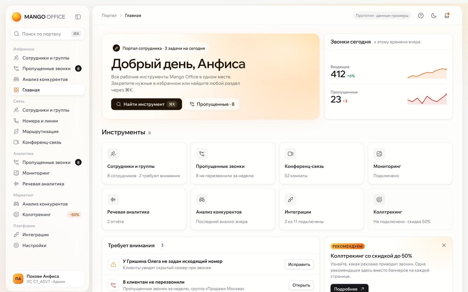
Employees don’t open the personal account for their profile. They use it to work. But sections had been added at different times by different teams, so each one looked and behaved its own way.
I audited seven screens, compared the account with five competitors, and proposed a new structure, design principles and redesigned screens.
- 6 of 7
- screens opened with a ~190 px promo banner
- 6
- styles for the primary button
- 5
- kinds of tabs and toggles for the same job
Counted during the audit.
02My role
Product Designer
- Heuristic audit (Nielsen’s 10), component inventory and end-to-end scenarios
- Competitor review from public screenshots
- Information architecture and navigation
- Design principles and a small visual system
- Redesign of seven screens and a staged release plan
03The challenge
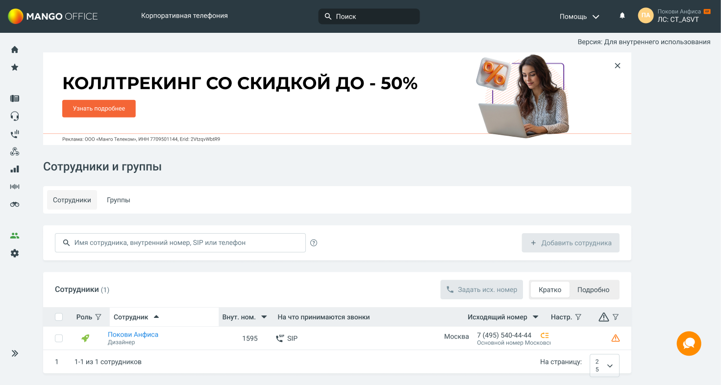
The problem wasn’t an old look. It was the lack of a system: ads above the work, an unlabelled icon menu, six button styles, empty screens with no next step, and long lists without search.
- 01Ten unlabelled icons in the menu, no breadcrumbs
- 02Empty states explained with text and a hand-drawn arrow
- 03Demo data that looked like real data
04Approach
4.1
An audit first, then one frame for every section
I started with an audit, not a visual refresh. Seven screens, three scenarios on each — find a tool, start a report, fix a problem — a component inventory, and a comparison with five competitors from public screenshots. The findings were structural: ads above the work, an unlabelled menu, six button styles, and empty screens with no next step.
The new account uses one page template. Employees and groups, conference rooms, monitoring and integrations all sit in it. The menu is labelled and grouped, search runs across the portal, and an empty screen says what to do next.
05Key flows
5.1
Audit
I walked through each screen with three scenarios: find a tool, start working with a report, fix a problem. Every issue was mapped to a heuristic, the screens it affects and a severity.
 Open full size
 Open full size
5.2
Employees and groups
Problems are now written in words, filters are chips above the table, row actions sit in a menu, and delete asks for confirmation.
Open full size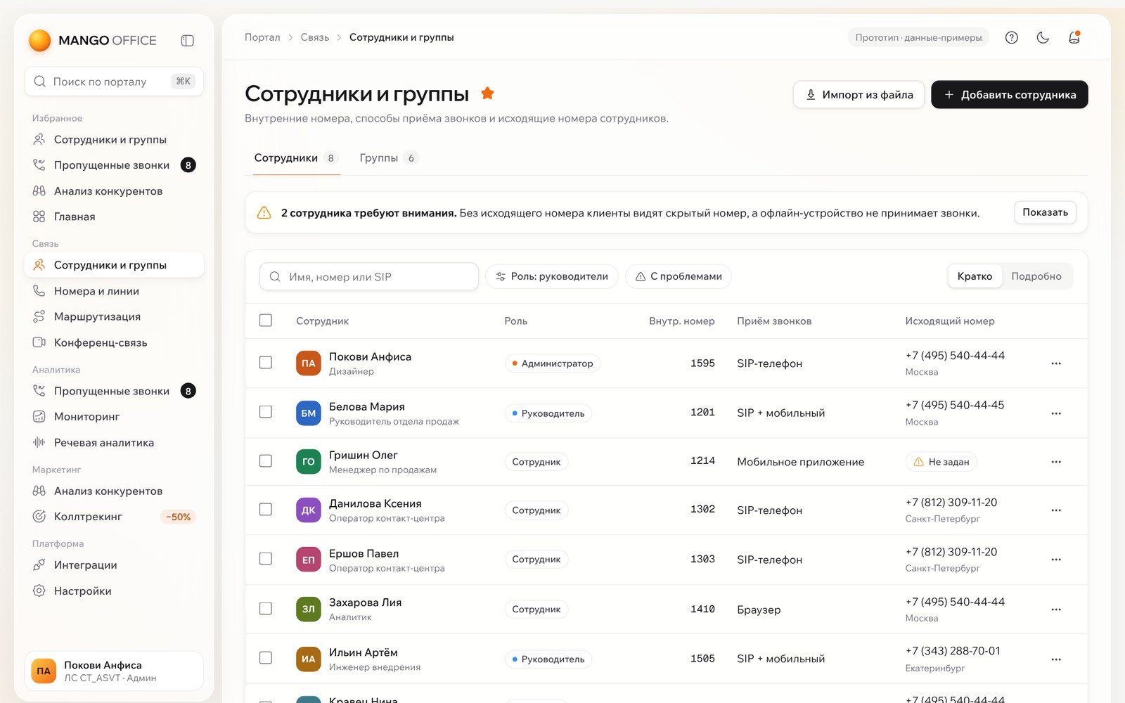 Open full size
5.3
Conference calls
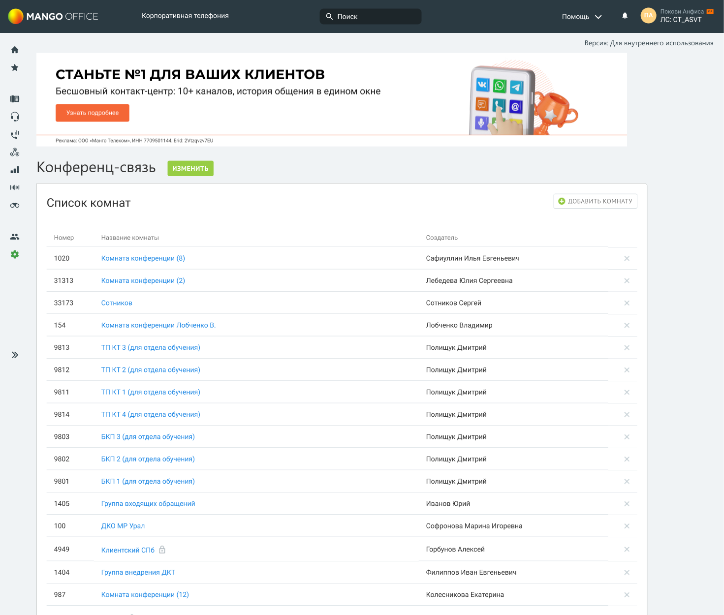
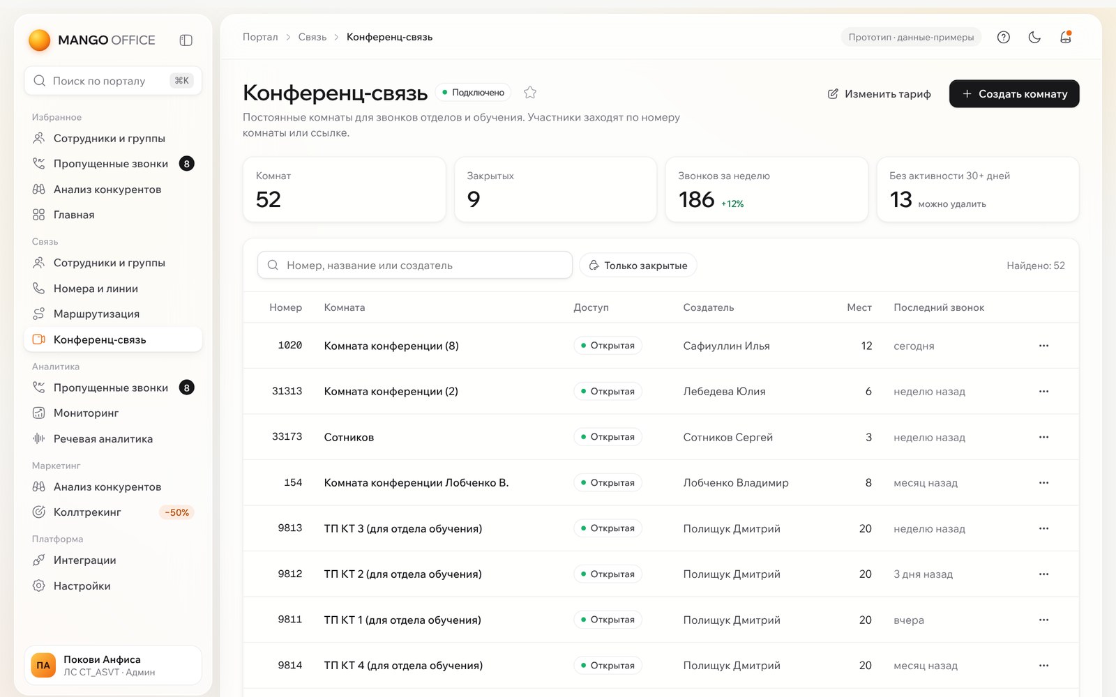
A summary on top, then search, filters and pages of 12 rooms instead of a 50+ row list with a delete cross in every row.
 Open full size
 Open full size
5.4
Monitoring and analytics
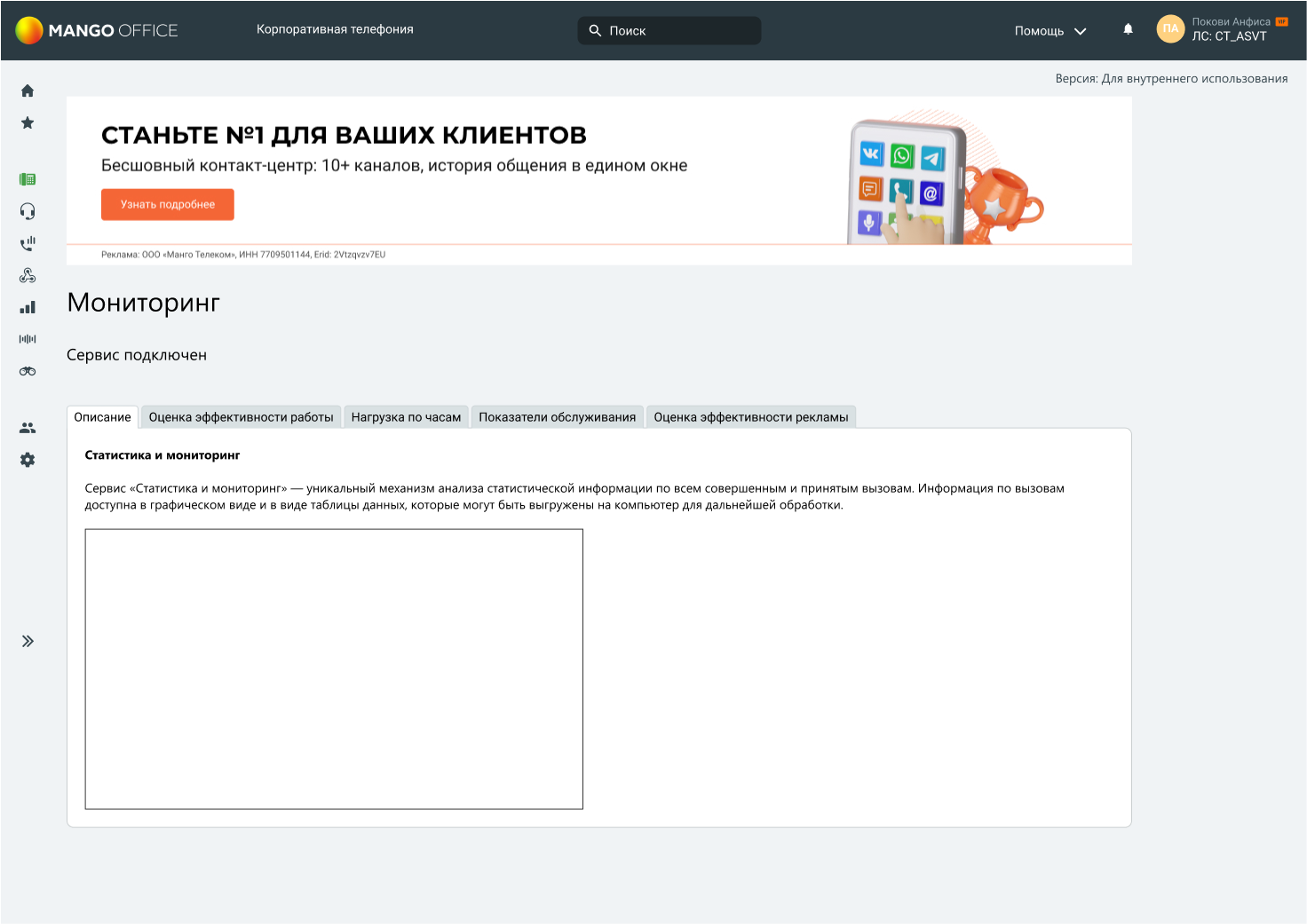
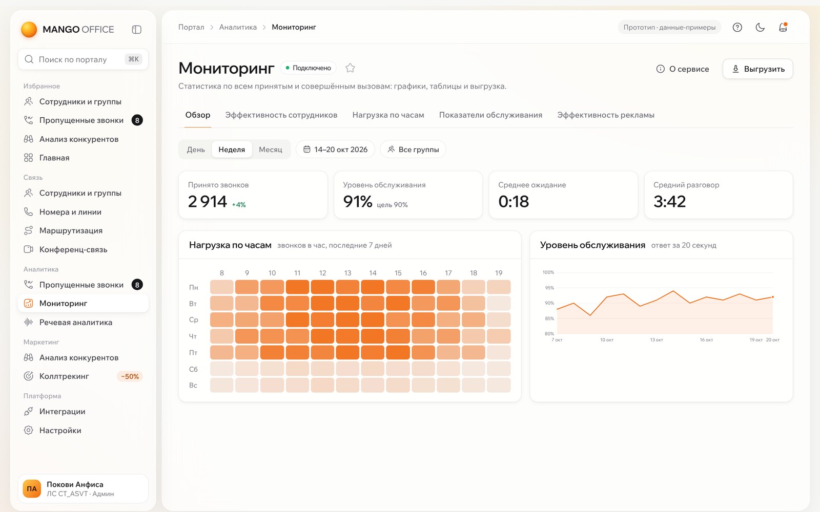
Data opens first. A load heat map shows when people are needed on the line, and service level is shown against a 90% target so the number reads as good or bad.
 Open full size
 Open full size
5.5
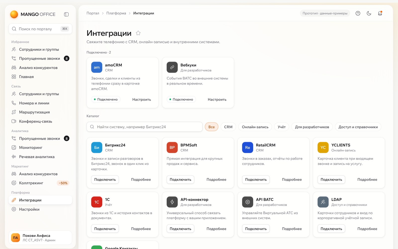
Integrations
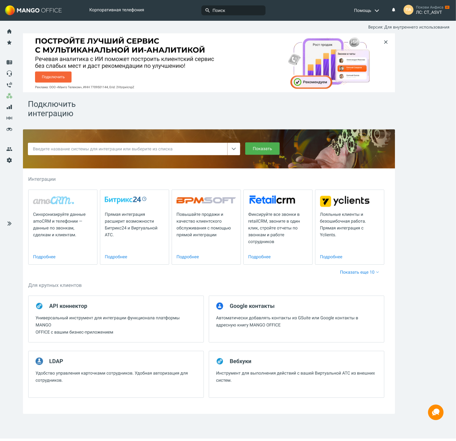
Connected systems on top, each with a Configure button, then a catalogue grouped by task instead of by client size.
 Open full size
 Open full size
06Design decisions
One frame
Every section lives in the same page template. Only the content changes.
Work first
The first screen is the work. Recommendations are one card on the home page.
Colour means something
Black for the main action, Mango orange as the accent, status as a coloured dot.
No dead ends
Every empty state says what will be here and what to do first.
Find it in seconds
A labelled menu in four groups, favourites and search across the portal with ⌘K.
07Outcome
I proposed releasing the new account in three stages: the frame first (menu, header, home, ⌘K, with a way back to the old account), then the component library, then moving sections to the template, starting with Employees and Missed calls.