From scattered screens to one portal for every internal tool.
The personal account where Mango Office employees set up telephony, read analytics, study competitors and connect integrations.
- Mango Office
- 2026
- Audit · Redesign · Desktop + Mobile
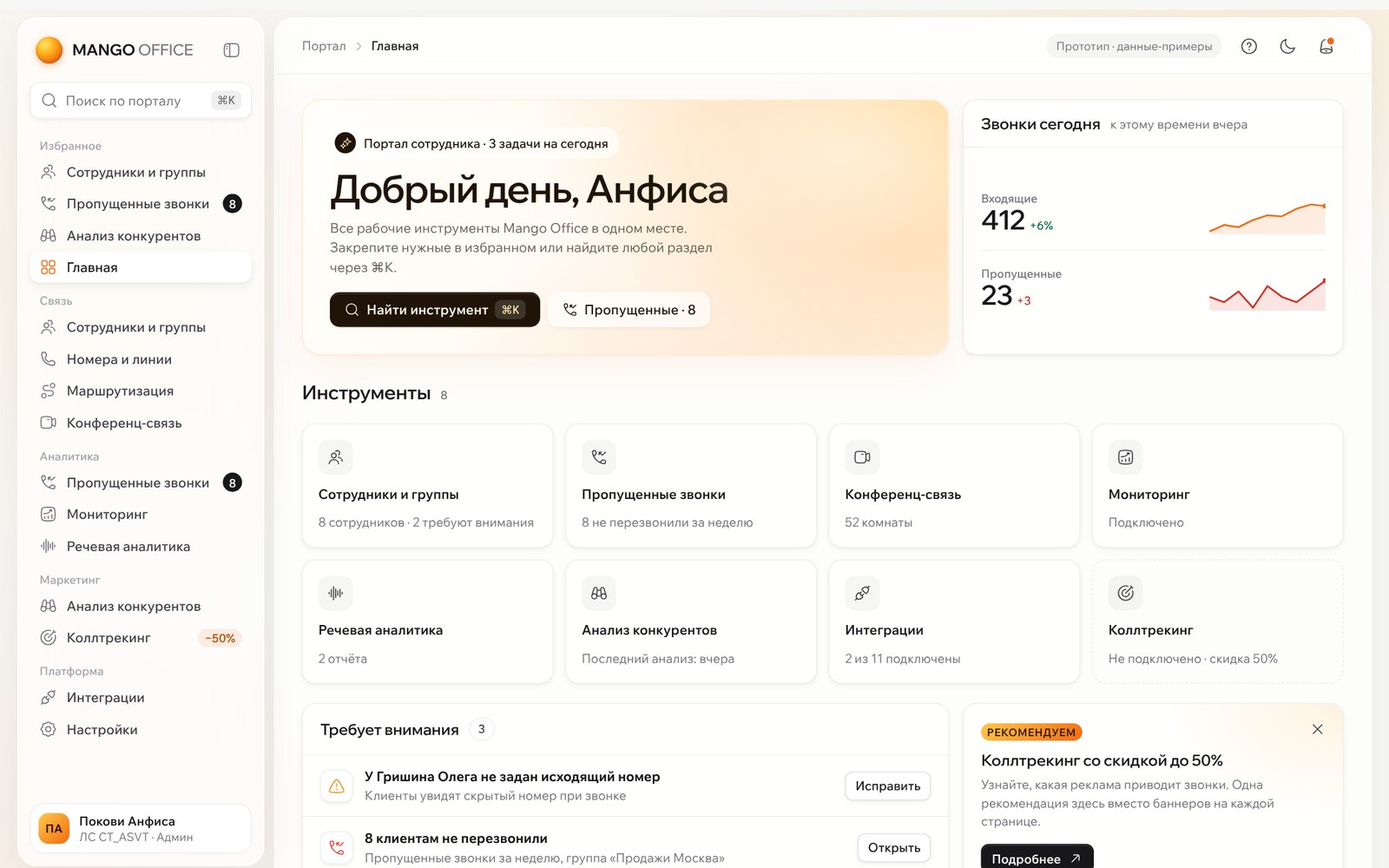
The way in to every work tool.
Employees don’t open the personal account for their profile. They use it to set up telephony, read analytics, study competitors and connect integrations.
Sections were added at different times by different teams, so each one looks and works its own way. The task was to audit the current interface and propose a redesign.
Method: Nielsen’s 10 heuristics, a component inventory and end-to-end scenarios: find a tool, start working with a report, fix a problem.
| Screen audited | What the user needs |
|---|---|
| Employees and groups | Numbers and how calls are received |
| Conference calls | Rooms for each department |
| Missed calls | Who has not been called back |
| Monitoring | Load and service level |
| Speech analytics | Quality of conversations |
| Integrations | Connecting to a CRM |
| Competitor analysis | Advertising and traffic |
The problem wasn’t an old look. It was the lack of a system.
- 6 of 7
- screens open with a promotional banner about 190 px tall
- 6
- styles for the primary button: two greens, orange, grey, caps and outline
- 5
- kinds of tabs and toggles for the same job
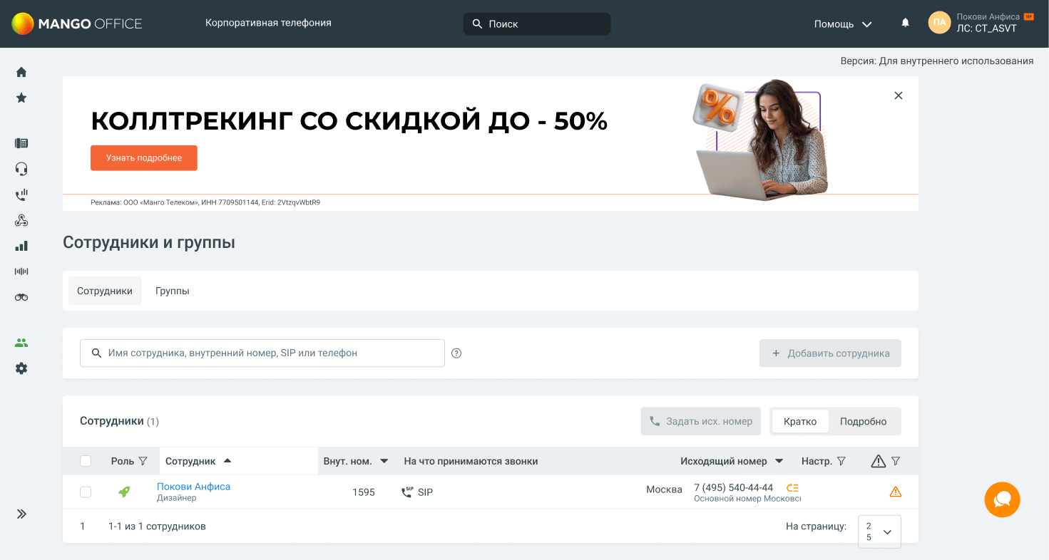
Misleading header
Internal version label
Ad above the work
Icon-only menu
Orange goes to chat and ads
Ads take the place of work
The banner sits above the section title, so the first thing people see is «Call tracking −50%», not the section they came to. Some banners close, some don’t, and closing is not remembered. Employees are sold products they sell to clients themselves.
Ten icons to guess
The left menu has no labels and no named groups. Binoculars mean competitor analysis, a wave means speech analytics. The active section is shown only by a green icon, and there are no breadcrumbs.
Six styles for the main action
Green means primary action, active section and connected service at the same time. «Add employee» is grey and looks disabled, five «Expand» buttons are bright green, and orange is used only for ads.

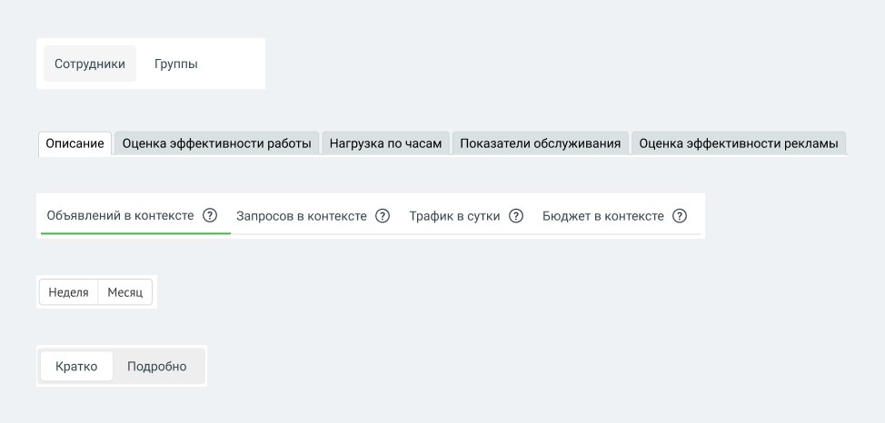
Five ways to switch a view
Pills, folder tabs, underlines, framed buttons and a toggle. Section tabs and the density toggle look almost the same, although one changes the content and the other only the layout.
Empty screens with no next step
Missed calls explains itself with text and a hand-drawn arrow. Monitoring opens on a Description tab with an empty frame, and the data sits in other tabs.
Long lists without tools
50+ conference rooms in one list with no search, filter or pages, and a delete cross in every row. Truncated numbers and a warning icon that doesn’t say what is wrong.
Data that is hard to read
The AI conclusion is one block of monospaced text. Demo charts dated 2020 look like real data. No screen gives a summary: how many were missed, is that good or bad, what to do.
| Problem | Heuristic | Screens | Severity |
|---|---|---|---|
| Navigation without labels or groups | Recognition rather than recall | all 7 | High |
| One-click delete without confirmation | Error prevention | 2 | High |
| Empty states without a next step | Visibility of system status | 3 | High |
| Ads above content | Minimalist design | 6 | Medium |
| 6 button styles, 5 kinds of tabs | Consistency and standards | all 7 | Medium |
| No search or filters in long lists | Flexibility and efficiency | 2 | Medium |
| Demo data not clearly labelled | Match with the real world | 1 | Low |
| Different spacing and heading fonts | Consistency and standards | all 7 | Low |
How the accounts we are compared with look.
Five products from the Russian market: four independent cloud PBX providers with a similar portfolio, and Bitrix24, where many Mango clients work.
Based on public screenshots from the companies’ websites, help centres and the a2is.ru catalogue, October 2026. No live accounts were used, so only what is visible is compared.
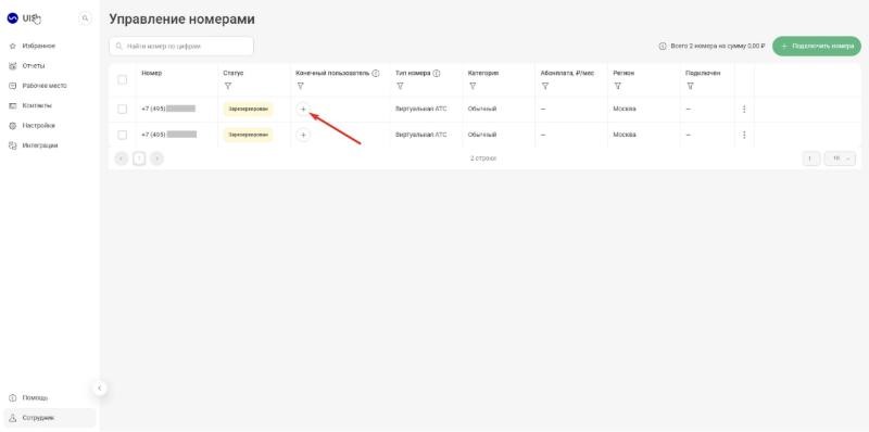
UIS
Cloud PBX, ad analytics and speech analytics: the closest to Mango’s product set.
- Labelled menu with favourites on top. Empty screens explain what will appear and give one button. Row actions in a «⋮» menu.
- A filter funnel in every column, small pale grey text.
- Favourites, empty states with one button, row menus. Filters as chips above the table.
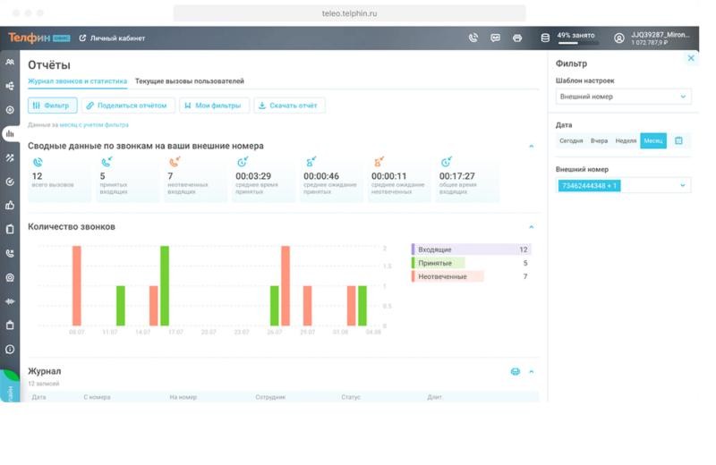
Telfin
Cloud PBX and contact centre.
- Reports start with a KPI summary: total, answered, missed, average wait. Quick periods and filters in a side panel.
- Dark icon-only menu, a promo banner first on the home page, home is a list of sections.
- The KPI summary above the chart. Not the icon menu or ads in work screens.
Novofon
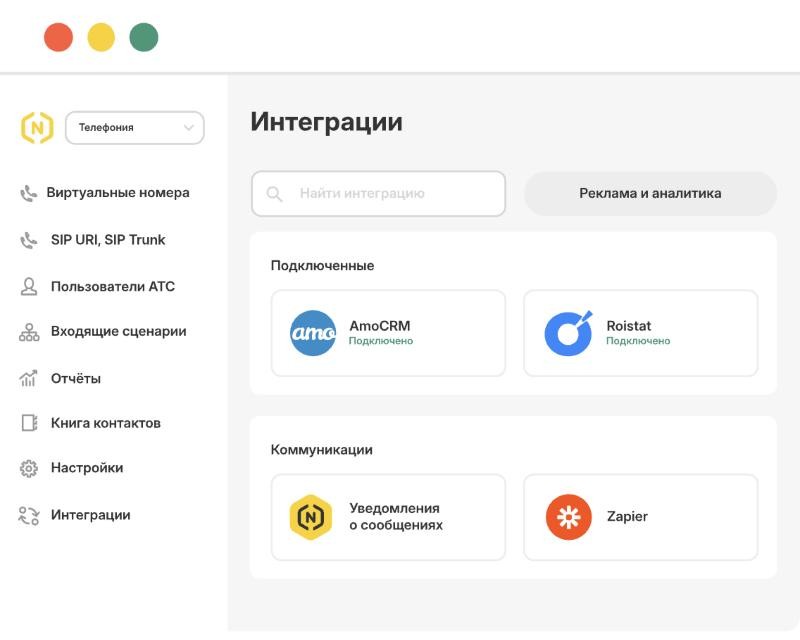
Cloud PBX and numbers for small and medium businesses.
- A product switcher above the menu. Connected integrations on top. Calm reports with period segments and filters.
- The site shows a stylised account that may differ from the real one.
- Connected first. A product switcher and a visual call-flow builder for later.
Sipuni
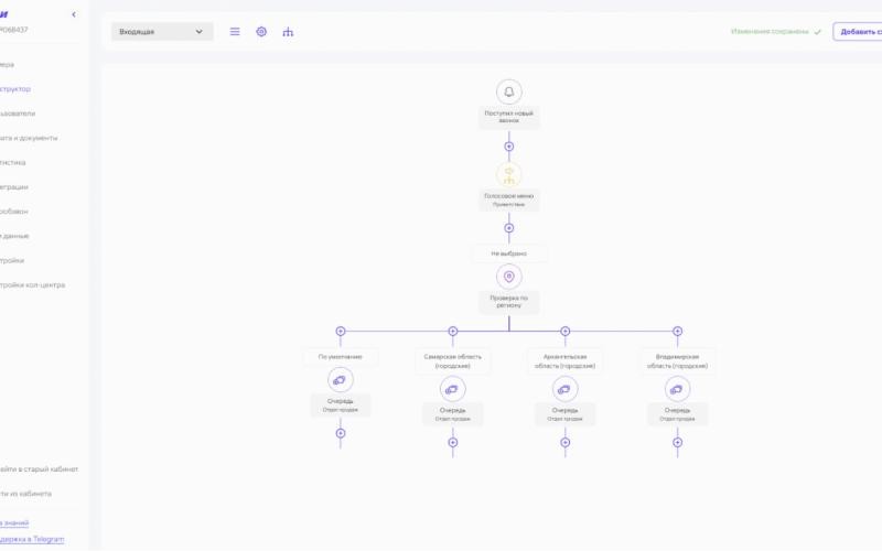
Telephony for small businesses, with a recently launched new account.
- A visual builder for incoming calls. Status and licence right in the row. A link back to the old account.
- Very small, low-contrast text. Row actions are unlabelled icons.
- The release strategy: new account section by section, with a way back to the old one.
Bitrix24
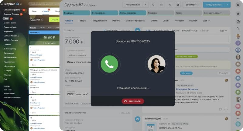
The CRM many Mango clients work in. It shapes what they expect from an interface.
- The call opens over the deal, so people stay in the CRM. Chart and table by employee on one screen.
- Very dense: many colours, panels and menus at once.
- For CRM users the account is for setup and control, so integration status must be clear.
| Pattern | Mango now | UIS | Telfin | Novofon | Sipuni | Bitrix24 | Mango 2.0 |
|---|---|---|---|---|---|---|---|
| Labelled menu | no | yes | no | yes | yes | yes | yes |
| Favourites or search | partly | yes | — | — | — | yes | yes, ⌘K |
| KPI summary in reports | no | — | yes | yes | — | partly | yes |
| Empty screen with an action | no | yes | — | — | — | — | yes |
| Call-flow builder | — | — | — | yes | yes | — | planned |
| Ads in work screens | 6 of 7 | — | home | — | — | — | 1 card |
A labelled menu is already the market standard. Of the five, we didn’t see search across the whole portal, a “what matters today” home page or a dark theme in any of them.
Five rules behind the new account.
Each rule closes a group of problems from the audit: the frame fixes grid and type, work-first removes ads, colour fixes the buttons, no dead ends fixes empty states, and findability fixes navigation.
One frame
Every section lives in the same page template. Only the content changes.
Work first
The first screen is the work. Recommendations are one card on the home page.
Colour means something
Black for the main action, Mango orange as the accent, status as a coloured dot.
No dead ends
Every empty state says what will be here and what to do first.
Find it in seconds
A labelled menu, favourites and search across the portal with ⌘K.
A menu by task, and one anatomy for every page.
Home · Favourites · Search ⌘K
Employees and groups · Numbers and lines · Routing · Conference calls
Missed calls · Monitoring · Speech analytics
Competitor analysis · Call tracking
Integrations · Settings
Labels are always visible, and the menu can collapse to icons. Counters show where action is waiting, such as «Missed calls 8». Products that aren’t connected appear in the menu with a label, instead of a banner on every page.
Colour
Near-white background with glass panels. Black for the main action, Mango orange for the logo, the active item and charts. Status as a green, amber or red dot.
Type and icons
Wix Madefor Display for headings and Text for the interface, on a scale of 12 · 13 · 14 · 16 · 20 · 28 · 40. Hugeicons Stroke Rounded, 1.5 px line.
Buttons and forms
Four button types: primary, secondary, quiet and destructive. Radii: panels 20, cards 14, buttons and fields 10.
Switch between the old screen and the live prototype.
Pick a section. Before shows the previous screen with its problems marked. After opens the clickable prototype on the same section: try ⌘K search, star a section, build the missed calls report, delete a room or switch the theme. All data in the prototype is sample data.
Employees and groups
The previous screen, with what was wrong marked. Switch to After to click through the redesign.
Filters hidden in headers
Main action looks disabled
Warning without words
Broken page-size control
Every section now works the same way.
| Topic | Before | After |
|---|---|---|
| Visual style | Dark header, grey-blue background, mixed styles | Near-white background, glass panels, Mango accents |
| Type and icons | Different fonts and icon sets | Wix Madefor, a scale of 7 sizes, Hugeicons |
| Navigation | 10 icons without labels | Labelled menu in 4 groups, favourites, ⌘K |
| First screen | A promo banner on 6 of 7 screens | Title and work; one recommendation on the home page |
| Buttons and status | 6 styles, green on everything | 4 button types; status as a coloured dot |
| Tabs | 5 kinds | Tabs for sections, a segment for the view |
| Empty states | Text and an arrow, an empty frame | Steps, a result preview, a button |
| Tables | Long lists, delete with a cross | Search, filters, pages, «…» menu, confirmation |
| Data | Charts without totals, demo looks real | Summary on top, «Demo» label |
| New | — | Home page, dark theme, mobile layout |
Menu, header, home, ⌘K
Visible on every screen at once, with a link back to the old account.
Buttons, tabs, table, empty state
A library in Figma and code, with light and dark theme tokens.
Moving screens to the template
Starting with Employees and Missed calls, the most frequent scenarios.
A usability test with 5–7 employees will compare time to the right tool and task success before and after. After launch: use of search and favourites, the share of missed calls returned, and support requests about the account. Menu groups will be checked with card sorting first.