(02)Mobile
BusinessPad Mobile
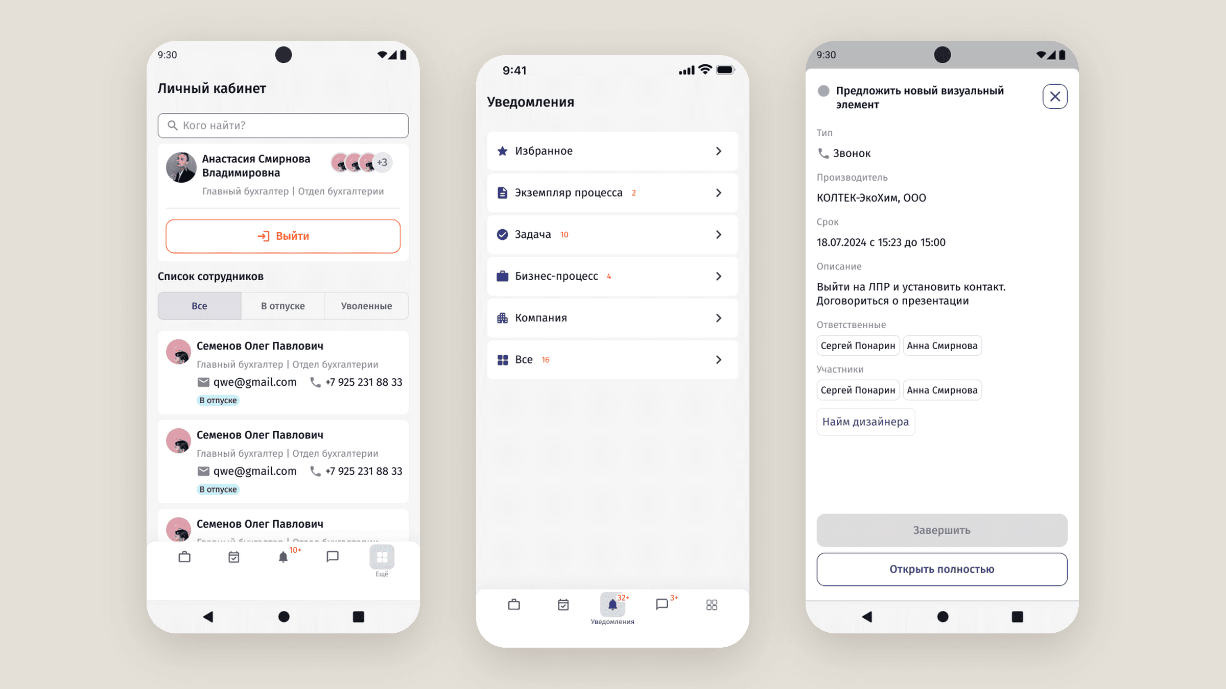
The first mobile version of BusinessPad, for people who need the ERP away from a desk. The desktop product couldn’t simply be squeezed into a phone.
- Company
- AVK Consulting
- Role
- Product Designer
- Year
- 2023–2025
- Type
- Mobile · ERP
01Overview
BusinessPad had been built around desktop workflows: wide tables, filters, forms and side panels. But users weren’t always at a desk when they needed something from the system.
I designed the mobile experience end to end, keeping it connected to the larger product: signing in, processes, tasks, documents, finance, chat and notifications.
02My role
Product Designer
- Information hierarchy and navigation for every workflow
- Mobile layouts for forms, tables, cards, filters and actions
- Empty, loading, error and success states
- Adapting desktop components to mobile
- Prototyping and collaboration with developers
03The challenge
The first question wasn’t “how do we make this responsive?” It was “what does the user actually need to do here?” For each workflow I asked what the main task is, what information is required, what can be secondary, and what can move into another interaction or disappear.
- 01Desktop tables on a phone mean tiny text or horizontal scrolling
- 02Less screen means less surrounding context
- 03Processes have many stages, and only some belong to the user
04Approach
4.1
The whole product, rebuilt for a smaller screen
The phone version covers the same work as the desktop: signing in, processes, tasks, documents, finance, goods, chat and notifications. None of it was a scaled-down table. Each workflow was taken apart and put back in the order a person needs it when they are not at a desk.
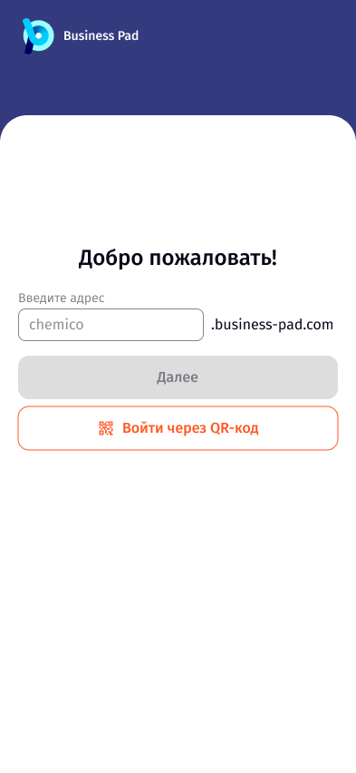
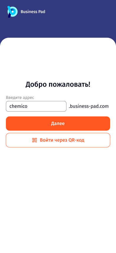
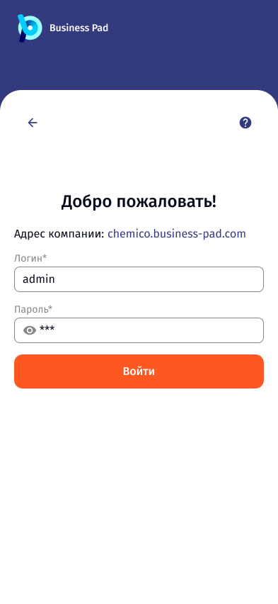
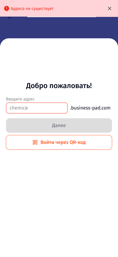
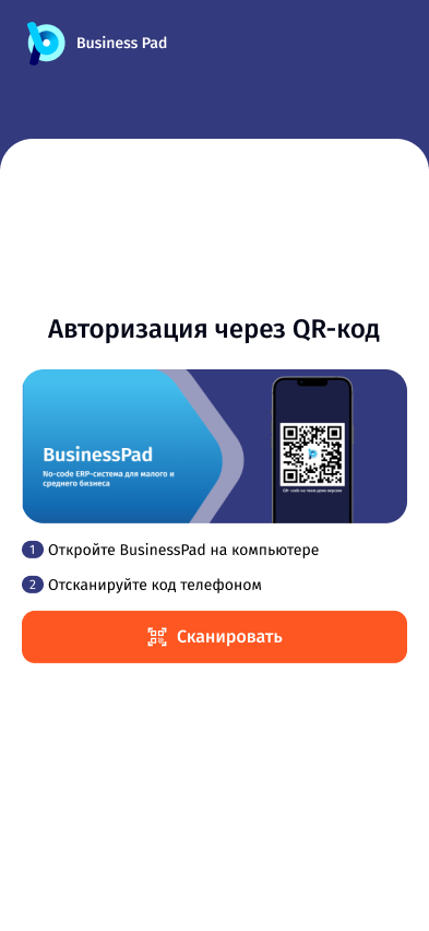
Signing in starts with the company’s address, then the person. People who already use BusinessPad on a computer can scan a QR code instead of typing. Processes open on the user’s own feed first. Stages are short forms, one result at a time. Finance and goods become cards. Chat sits next to the process it belongs to, and every notification opens the event it is about.
05Key flows
5.1
Signing in
The company first, then the person. People who already use BusinessPad on a computer can skip typing and scan a QR code.
- 1Enter the company address
- 2Log in or scan a QR code
- 3Switch accounts from the personal cabinet
 Open full size
 Open full size
 Open full size
 Open full size
 Open full size
5.2
Following a process
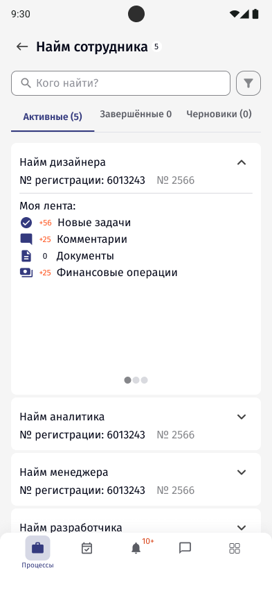
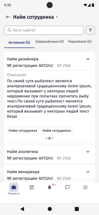
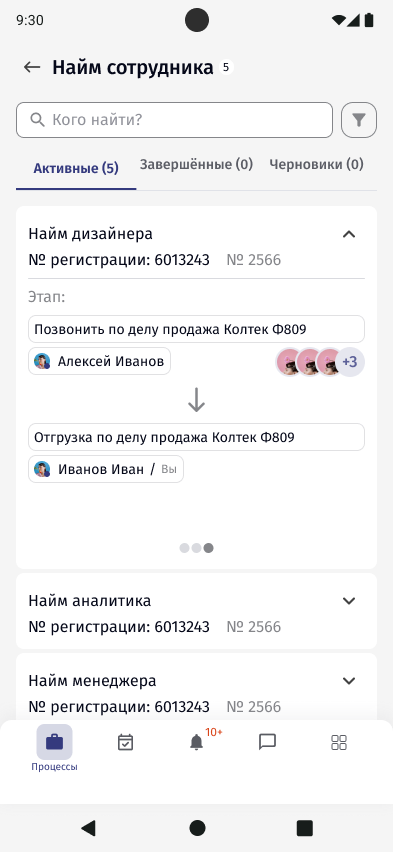
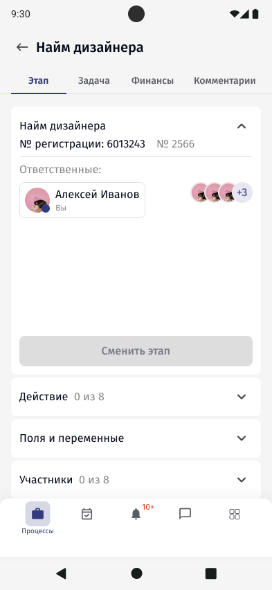
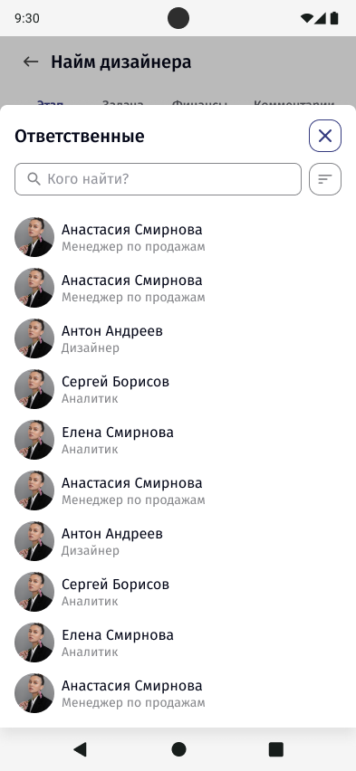
A process card opens on the user’s own feed first: new tasks, comments, documents and finance operations. The description and the stage route are one swipe away.
- 1See what changed for me
- 2Swipe to the description and route
- 3Open the stage
 Open full size
 Open full size
 Open full size
 Open full size
 Open full size
5.3
Completing a stage
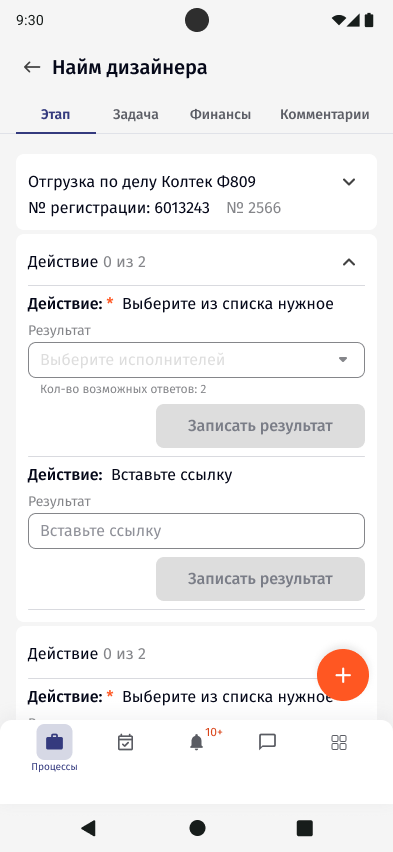
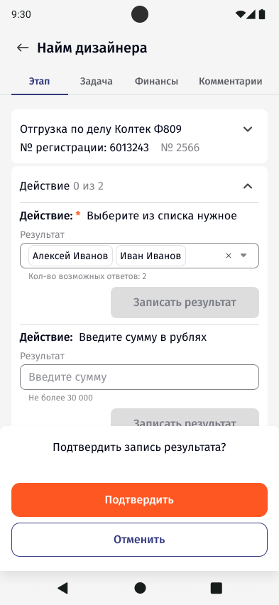
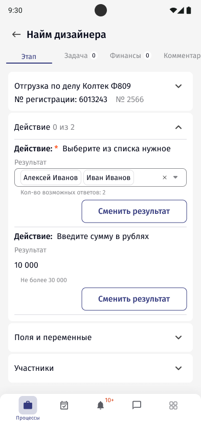
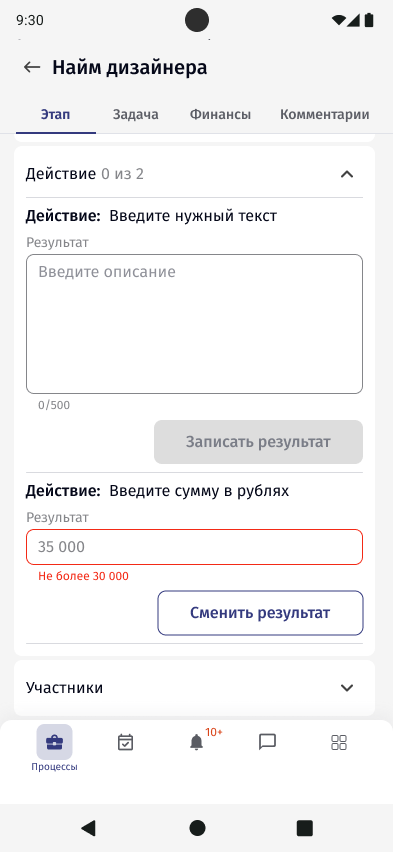
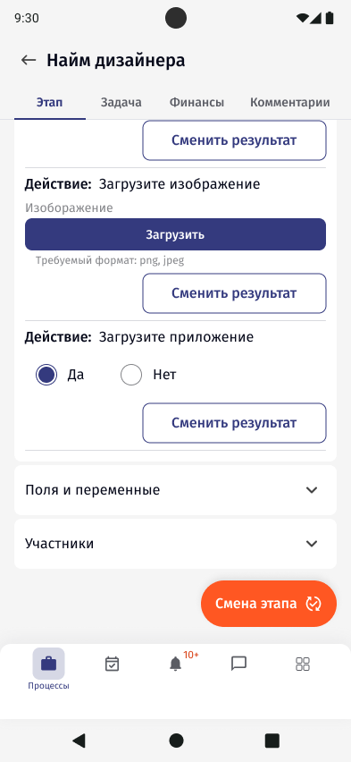
Inside a stage, every action is a short vertical form with one result. The button to change the stage only appears once the actions are done.
- 1Fill the action
- 2Confirm the result
- 3Change the stage
 Open full size
 Open full size
 Open full size
 Open full size
 Open full size
5.4
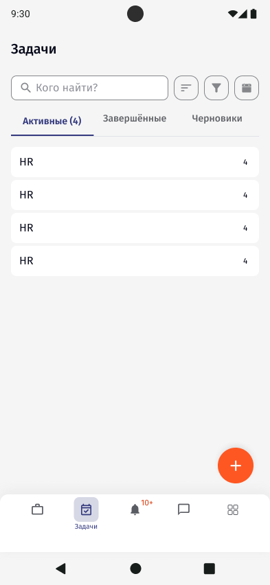
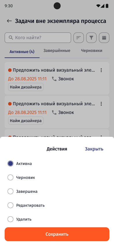
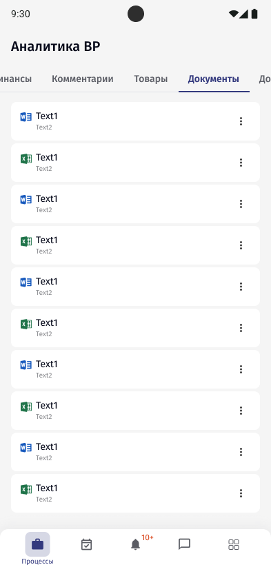
Tasks, documents, finance and goods
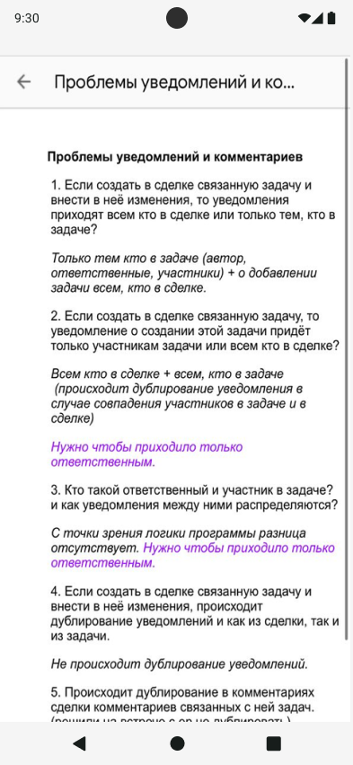
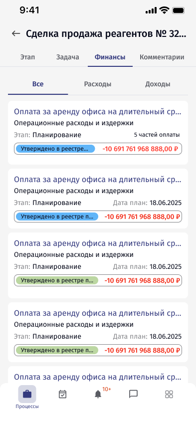
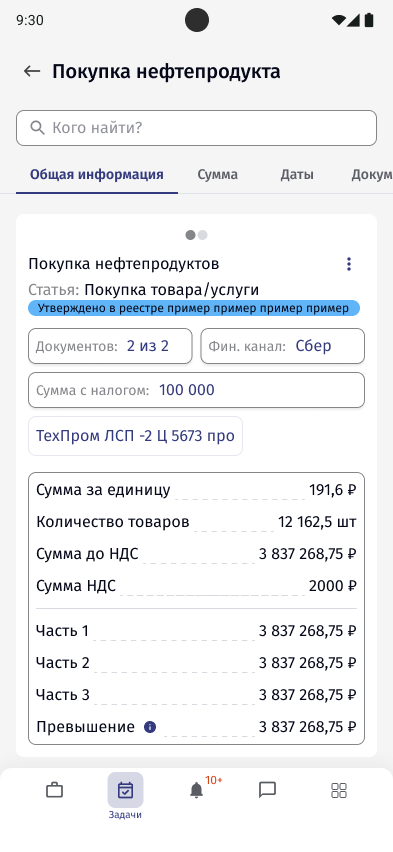
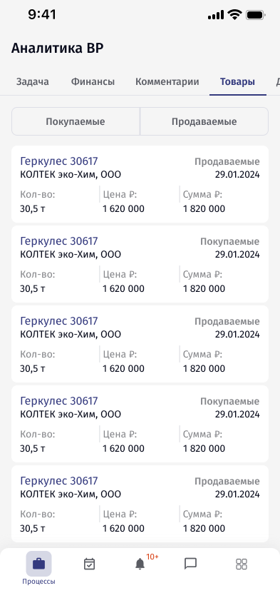
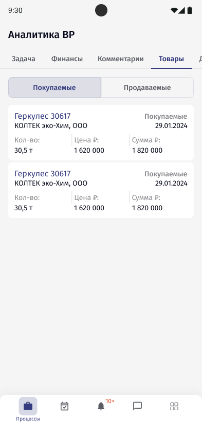
A status change is a bottom sheet with a confirmation. Documents show loading, refresh and open as their own states. Finance operations and goods are cards: status and amount first, bought or sold as a switch, and the rest of the record in tabs.
 Open full size
 Open full size
 Open full size
 Open full size
 Open full size
 Open full size
 Open full size
 Open full size
5.5
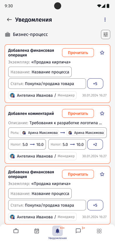
Chat and notifications
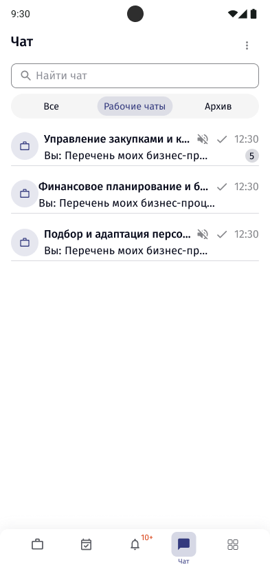
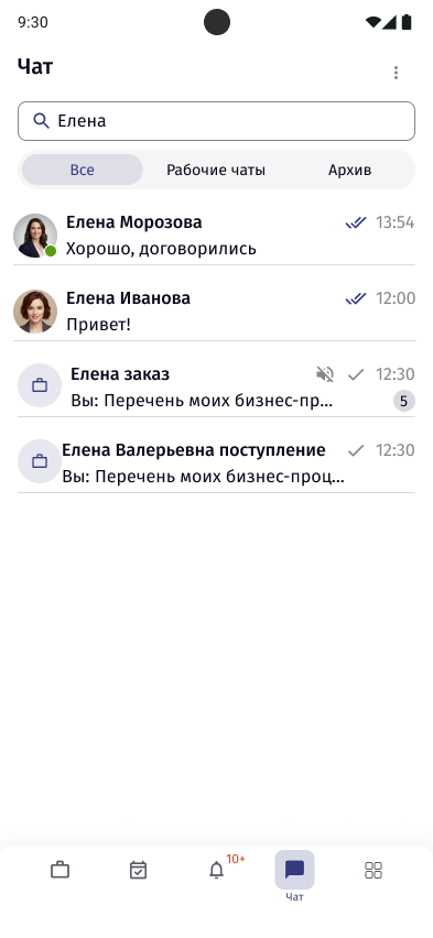
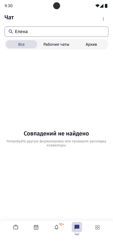
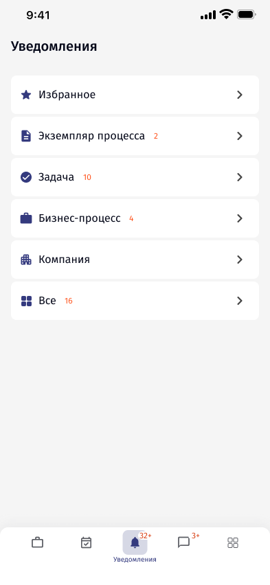
Work chats sit next to the process they belong to. Notifications are grouped by what they are about, and each one opens the event it refers to.
 Open full size
 Open full size
 Open full size
 Open full size
 Open full size
06Design decisions
Hierarchy before layout
Primary information first, then context, actions, and details only when needed.
Tables become cards
Status and amount up front; the rest of the record split into tabs.
One form, one result
Stage actions are small, sequential forms instead of one long page.
States are part of the flow
Loading, refreshing and opening a file were designed, not left to chance.
07Outcome
The goal was never for desktop and mobile to look identical. They needed to feel related: the same product language, with hierarchy and interaction adapted to the context.