Mobile forced us to decide what actually mattered.
Mobile ERP for people who need BusinessPad away from a desk.
- AVK Consulting
- Product Designer
- 2023–2025
- Mobile · ERP
The desktop product could not simply be squeezed into a phone.
BusinessPad had been built primarily around desktop workflows. Users were not always sitting at a desk when they needed information from the system.
Tables, filters, forms, navigation, statuses and actions were all designed around a relatively large screen. The first question was therefore not “How do we make this responsive?” It was “What does the user actually need to do here?”
I worked on adapting the BusinessPad experience for mobile while keeping it connected to the larger product. See the BusinessPad case →
Less space made hierarchy more important.
The desktop product was the starting point. I separated the things that were essential from the things that depended on having a larger screen. For each workflow, I asked:
- What is the main task?
- What information is required?
- What can be secondary?
- What can move into another interaction?
- What can disappear completely?
- Primary information
- What the user needs immediately.
- Secondary information
- Useful context that can be accessed when needed.
- Actions
- What the user can do next.
- Additional information
- Details that do not need to be visible all the time.
The company first, then the person.
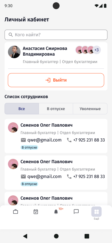
Signing in starts with the company's BusinessPad address, then the login. People who already use BusinessPad on a computer can skip typing and scan a QR code. Switching between accounts and signing out live in the personal cabinet.
Signing in
Welcome
The company address comes first, before any login.
What changed for me, before the whole process.
Processes are grouped by type: the workspace, tasks, finance operations, documents, material flow, goods and counterparties. Each type shows its own fields on the instance cards, and the user chooses which fields appear. Empty, no results, error and loading states are part of the same flow.
On a phone, a process instance card opens on the user's own feed first: new tasks, comments, documents and finance operations. The description and the stage route are one swipe away.
Inside the stage, every action is a short vertical form with one result. Fields were restructured into clearer vertical flows, with attention to hierarchy, spacing and the placement of actions. The button to change the stage only appears once the actions are done.
The card also had to decide which stage to show: the current one, the user's own, or both. A note in the file records that finding the user's next stage through gateways and forks was not implemented.
Processes by type
Choosing a type
Processes are split by what they are about.
Following a process
My feed
What changed for me, before anything else.
Completing a stage
Actions
Every action is a small form with one result.
Which stage the card shows
Current and mine
If the user has a stage ahead, both are shown.
Quick updates without opening every record.
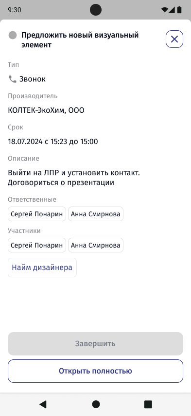
Checking deadlines, changing a status, creating a call or a meeting. Status changes happen in a bottom sheet with a confirmation, and one form creates a task, a meeting or a call.
Working with tasks
Tasks
Mobile also needed to handle the less obvious moments.
Loading, refreshing and opening a file were designed as states, not left to chance. These states were particularly important on mobile because there was less surrounding context to help explain what was happening.
Opening documents
Documents
Tables were one of the harder problems.
A desktop table can show multiple columns at once. On mobile, keeping the same structure usually results in tiny text, horizontal scrolling or both.
Instead, each finance operation became a card with its status and amount visible first. Everything else moved into the record itself, split into tabs: general information, amount, dates, documents and additional parameters. Goods follow the same idea, with bought and sold as a simple switch.
Reading a finance operation
Operations
Status and amount on every row.
Goods in a process
All goods
Conversations next to the work.
Chat covers personal and group conversations, with work chats that belong to a process. Search runs across every tab, a long press on a message opens reactions and actions, and each chat shows its participants and roles. System messages record what happened to the group.
Chat
Chats
All, work chats and archive in one list.
Every notification leads back to its event.
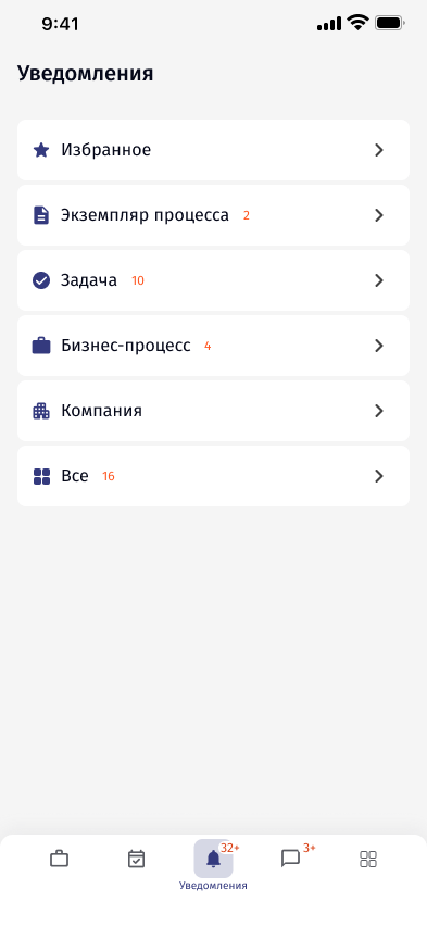
Notifications are grouped by what they are about: process instance, task, business process, company, plus favourites. Each card shows what changed, and opens the event it refers to.
Notifications
Sections
Grouped by what they are about.
Same product, different priorities.
The goal was never for the desktop and mobile versions to look identical. They needed to feel related. The same product language should be recognisable across both experiences, but the hierarchy and interaction could change depending on the context.