(11)Design Systems
BusinessPad Design System
The component library behind every BusinessPad screen: Material UI, rebuilt around BusinessPad’s visual language, workflows and edge cases.
- Company
- AVK Consulting
- Role
- Product Designer
- Year
- 2023–2025
- Type
- Design Systems
01Overview
BusinessPad is a large ERP with many dense, data-heavy screens. Designing each one from scratch didn’t scale, so the product needed one shared library. It lives in Figma as one page per component, with names that match the code.
- 55
- Component pages
- 9
- Type styles
- 7
- Input states
- 12
- Status chip colours
Counted from the Figma file.
02My role
Product Designer
- Tokens for colour, type and elevation
- Components and their full state matrices
- Table patterns
- The AI “Magic” layer
- Documentation on each component page
03The challenge
The library had to cover everything from buttons to process canvases, keep design and code describing the same thing, and give the AI assistant a visible place on the same components people already use.
- 01Most work happens in tables
- 02States are often designed too late
- 03AI-filled data must be recognisable
04Approach
4.1
One library for every BusinessPad screen
The UI kit is the component library the product is built from. It starts from Material UI and adapts it to BusinessPad: colour, type and elevation as tokens, then buttons, inputs, alerts, chat and tables, each with its full set of states.
MagicPad does not get a separate set of components. Anything the assistant fills or suggests uses Magic tokens on the components people already know. The same library is what the desktop product, the mobile app and CPQ are assembled from.
05Key flows
5.1
Foundations
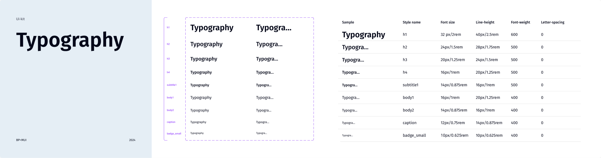
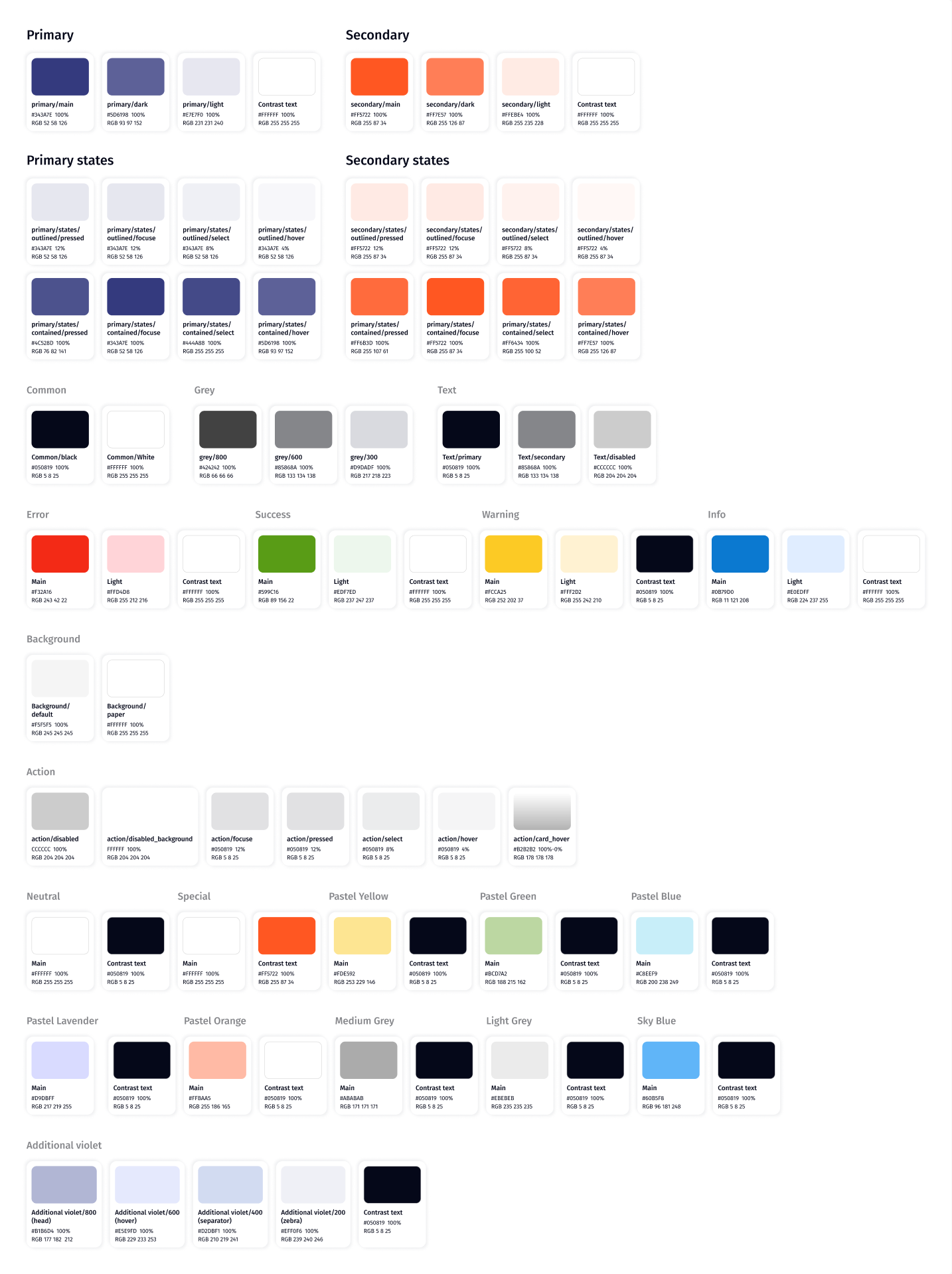
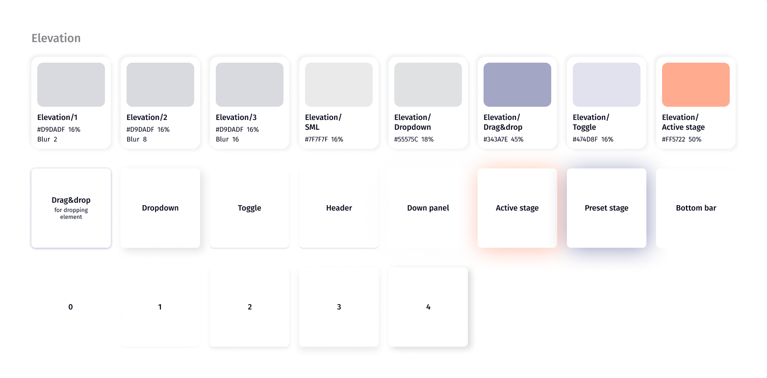
Colour, type and elevation are tokens. Colours follow MUI’s palette with separate tokens per state; pastel colours are kept for statuses; some shadows are named after where they’re used.
5.2
The AI layer
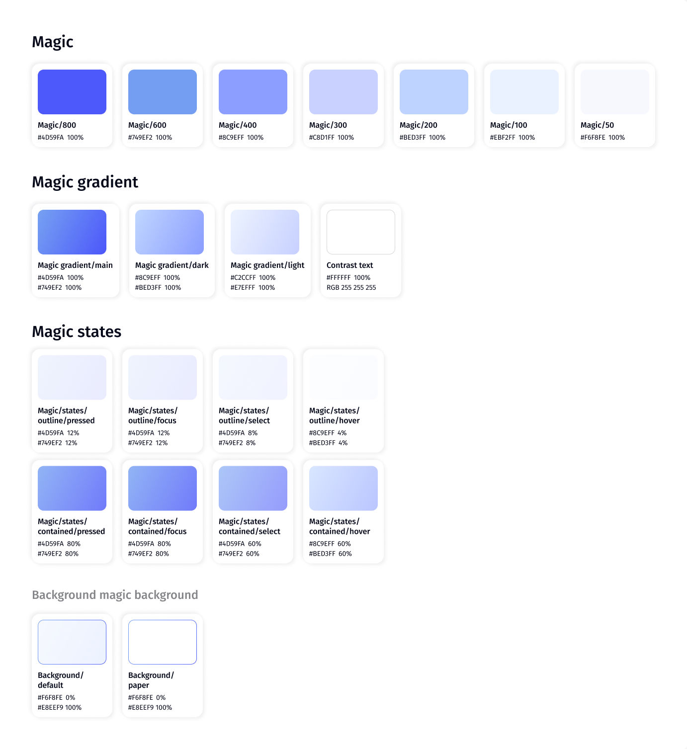
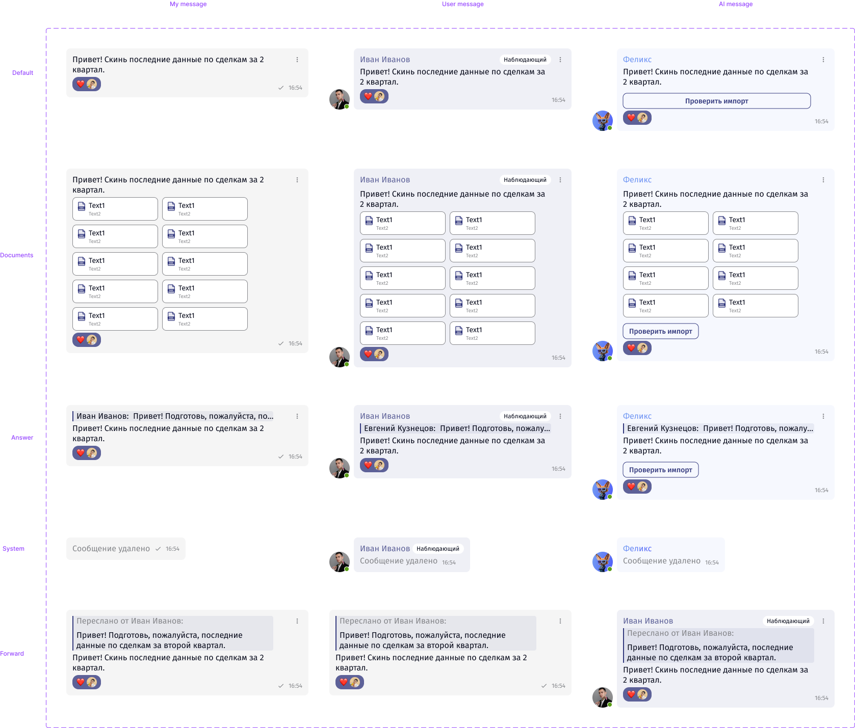
Anything MagicPad fills in or suggests uses Magic tokens: a blue-violet scale, gradients and their own states. Existing components get a magic variant instead of separate AI components.
 Open full size
5.3
Components
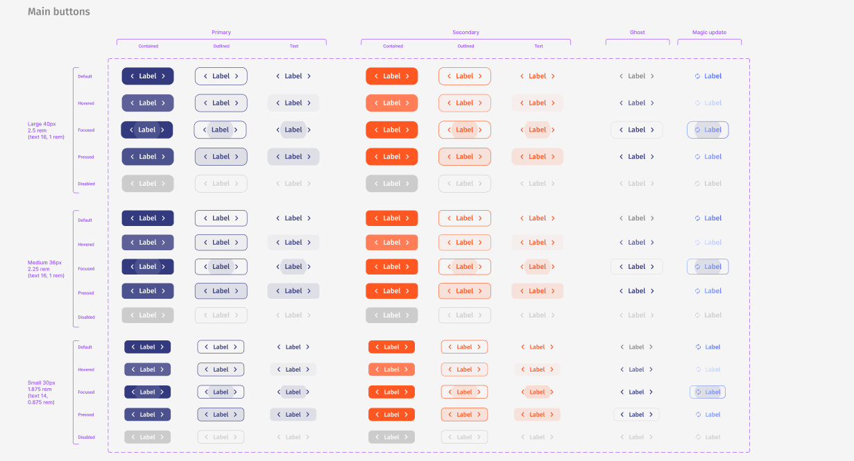
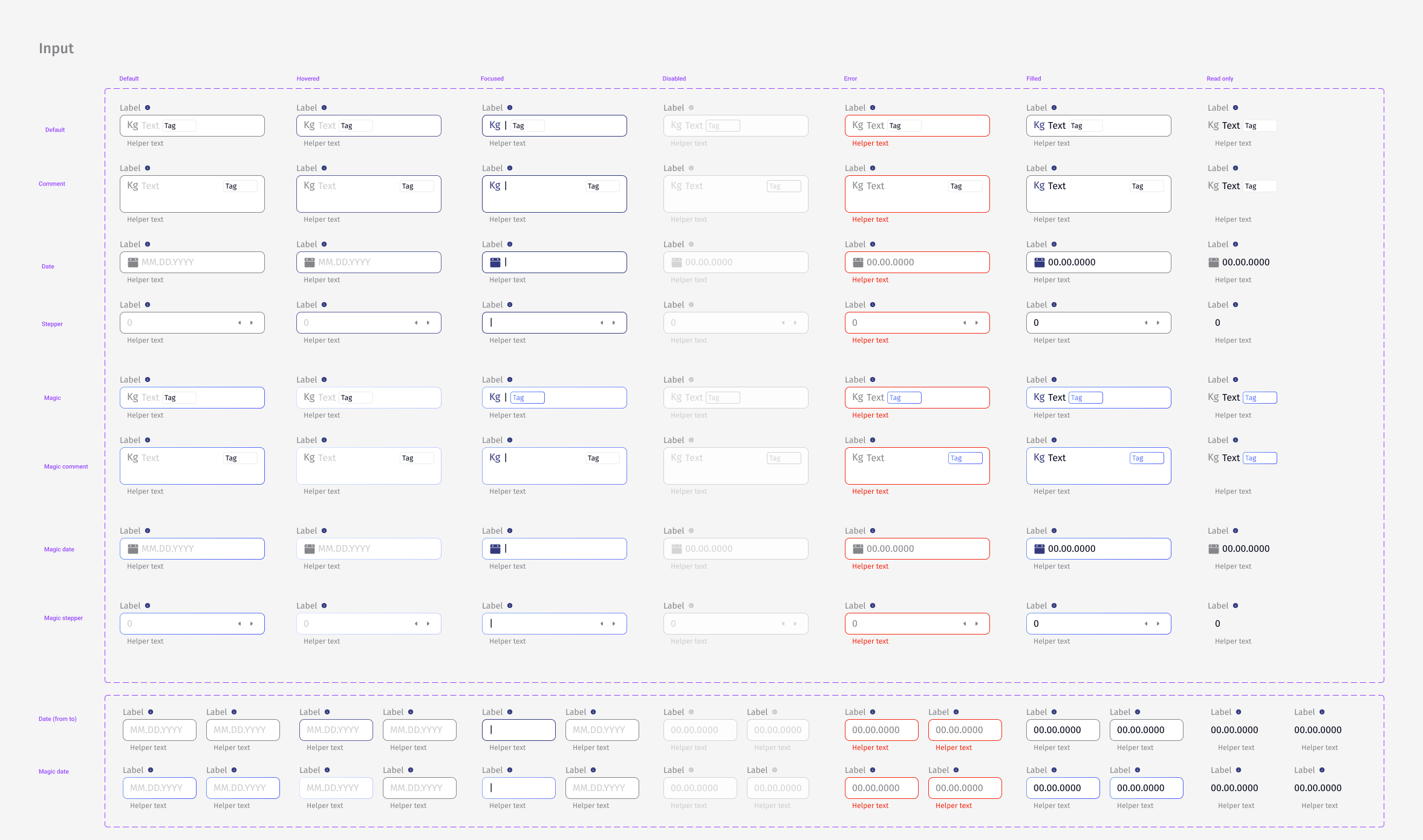
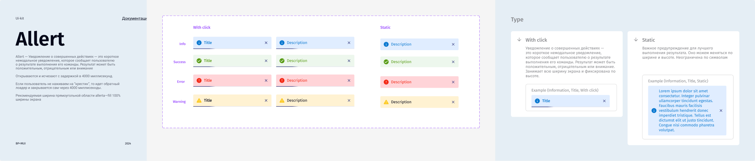
Each component page shows the full matrix of types, sizes and states, followed by notes on when to use each variant.
5.4
Table patterns
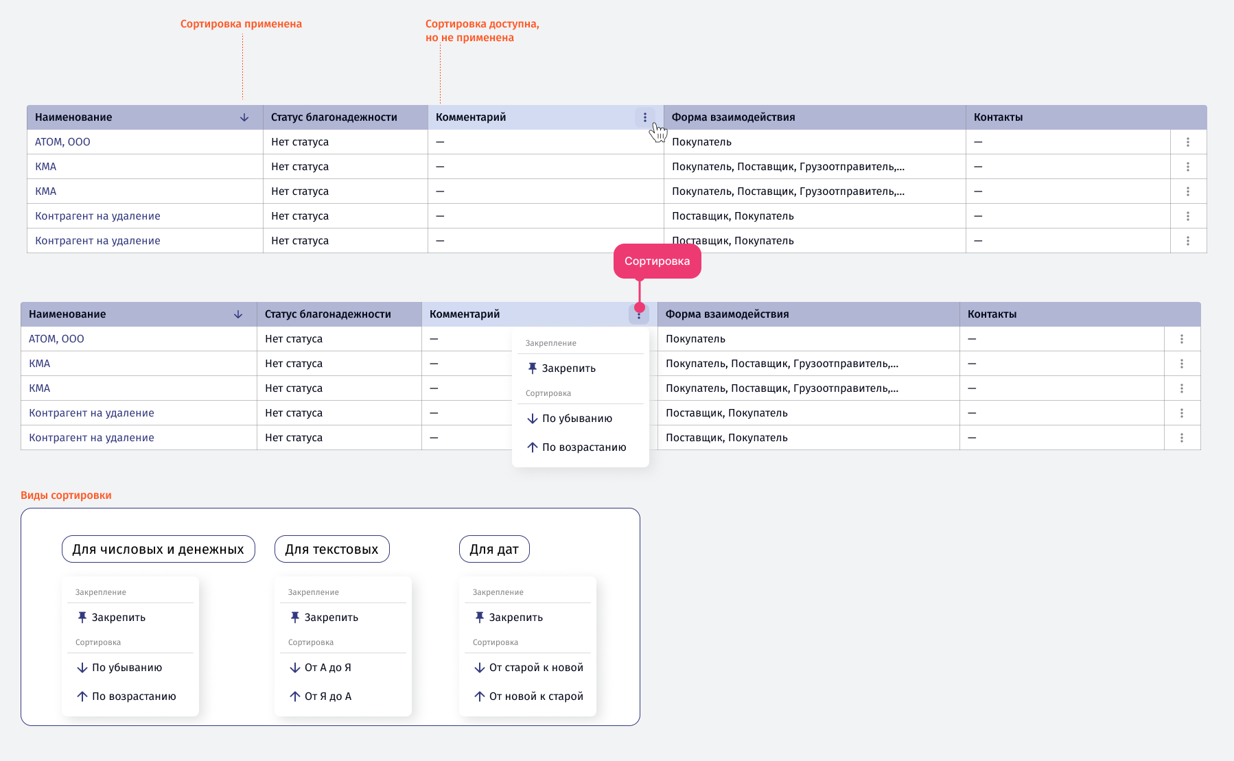
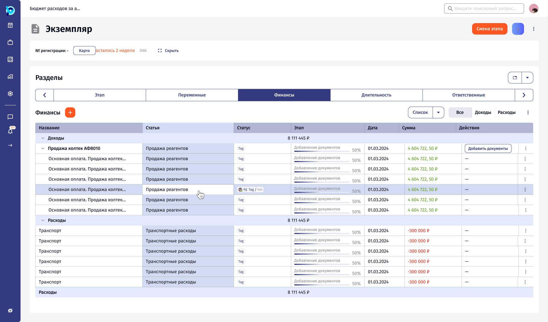
Sorting, columns, rows, quick filters, inline editing, bulk actions, expandable rows and hover, documented and used in the product.
 Open full size
 Open full size
06Design decisions
MUI as the base
Components keep Material UI names, so design and code describe the same thing.
States are part of the component
Hover, focus, error, disabled and read only are designed with the default.
AI gets its own layer
Magic tokens and variants mark what the assistant filled or suggested.
Documented on the page
What it’s for, then variants, then usage notes.
07Outcome
The library grew into 120+ reusable components that BusinessPad, its mobile app, CPQ and MagicPad are built from.