Back

BusinessPad Design System

One component library for every BusinessPad screen.

A Figma component library built on Material UI and adapted to BusinessPad: foundations, components, AI variants and data-heavy patterns.

Company
AVK Consulting
Role
Product Designer
Timeline
2023–2025
Type
Design System · Figma · MUI
Library cover: BusinessPad, MUI and Figma logos, the title «MUI for BusinessPad», «Material UI 2024», and BP, v6.1.0 and Pro labels

01 Overview

Material UI, rebuilt around BusinessPad.

BusinessPad is a large ERP with many dense, data-heavy screens. Designing each one from scratch did not scale, so the product needed one shared library.

The library takes Material UI as its base and adapts it to BusinessPad’s visual language, workflows and edge cases. It lives in Figma as one page per component.

55
Component pages, from accordion to vertical tabs
9
Type styles, from h1 to badge_small
7
Input states, from default to read only
12
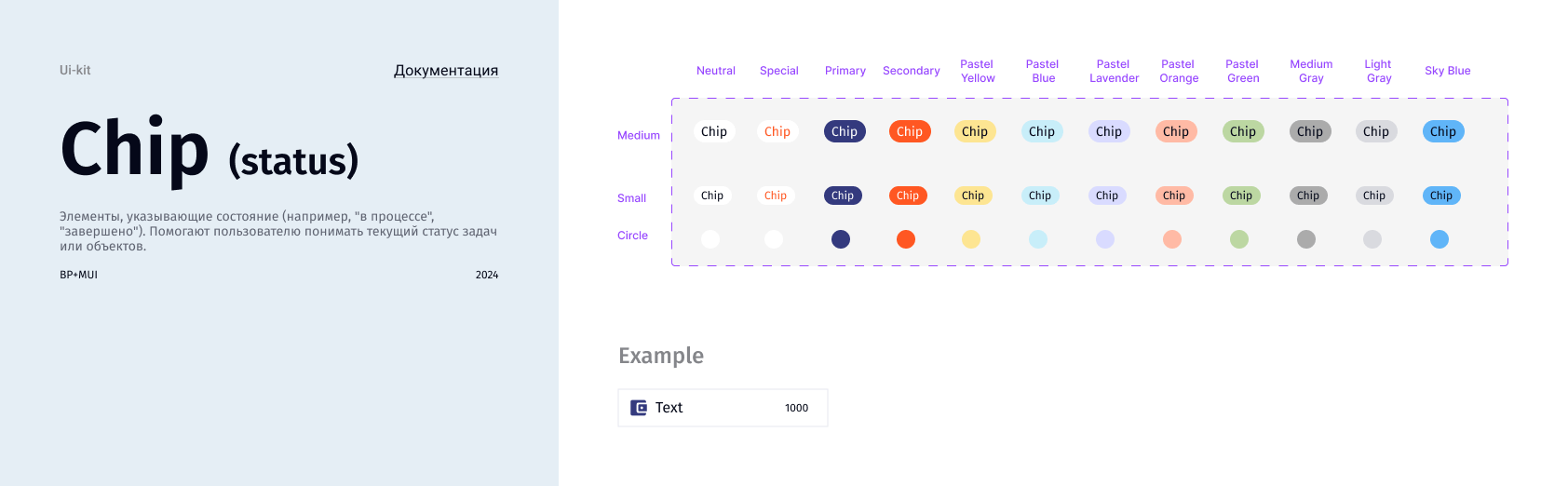
Status chip colours, in three sizes

02 Foundations

Tokens first, components second.

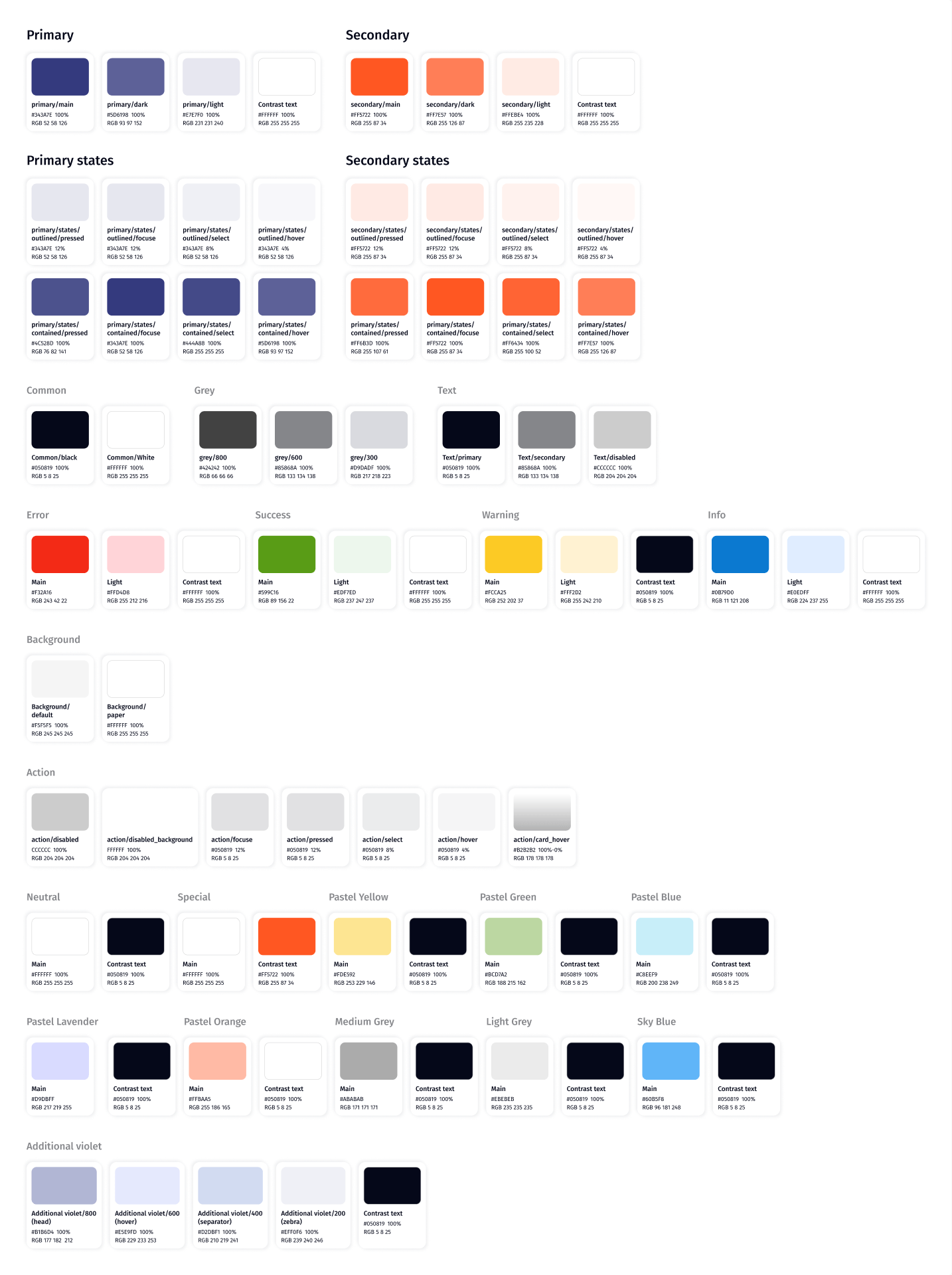
Colour, type and elevation are defined as tokens. Colours use MUI’s palette structure, with separate tokens for each interaction state. Pastel colours are reserved for statuses.

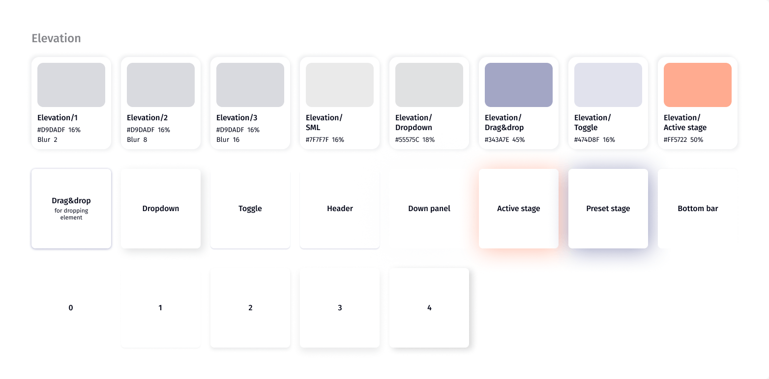
Some shadows are named after where they are used, such as dropdown, drag and drop and the active stage of a process.
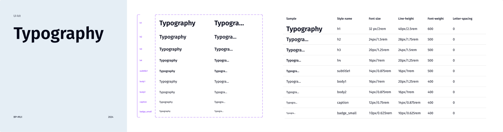
Typography page: nine styles from h1 (32/40, 600) to badge_small (10/10, 400) with font size, line height, weight and letter spacing
Colour tokens: primary and secondary with their states, common, grey, text, error, success, warning, info, background, action, neutral, special, pastel and additional violet palettes with hex and RGB values
Colour tokens, named after MUI’s palette: primary, secondary, states, feedback colours and pastel colours for statuses.
Elevation tokens: three general levels plus named shadows for SML, dropdown, drag and drop, toggle and active stage, with examples
Elevation: general levels, plus shadows named after where they are used, such as dropdown, drag and drop and active stage.

03 AI layer

A second palette for what the AI does.

BusinessPad has an AI assistant, MagicPad. Anything it fills in or suggests uses the Magic tokens: a blue-violet scale, gradients and their own states.

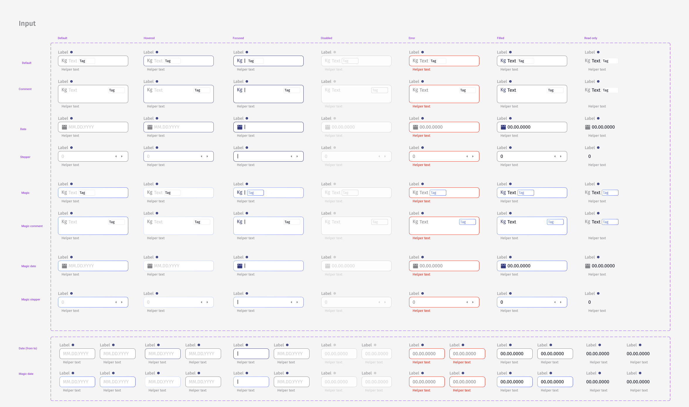
Instead of separate AI components, existing ones get a magic variant. Inputs have magic default, comment, date and stepper versions, and buttons have a magic update style.
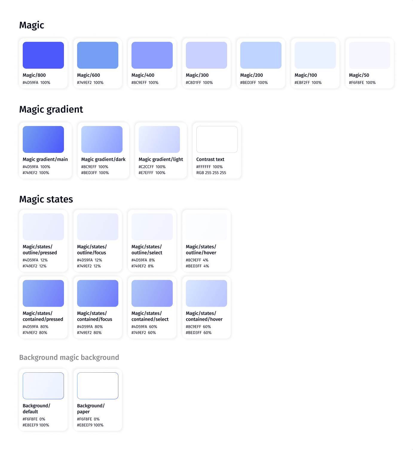
Magic colour tokens: a blue-violet scale from Magic/800 to Magic/50, three magic gradients, magic outline and contained states, and magic backgrounds
Magic tokens: a separate scale, gradients and states reserved for AI.

04 Components

Every variant, in every state.

Each component page shows the full matrix of types, sizes and states, followed by notes on when to use each variant.

  • Inputs and controls

    Button, icon button, input, select, checkbox, radio, toggle, slider, calendar, date cell

  • Navigation and structure

    Horizontal and vertical tabs, breadcrumbs, drawer, stepper, pagination, tree view, grid, paper, card

  • Feedback and status

    Alert, chip, tags, badge, tooltip, hint, helper text, progress bar, skeleton, timeline

  • Data

    Table and data grid: sorting, columns, rows, inline editing, bulk actions, expandable rows

  • Chat and AI

    Bubble message, chat input, chat header, left panel, system events, reactions, Magic Think

  • BusinessPad-specific

    Canvas, process instance, onboarding, BP help

Button types: primary, secondary and inherit, each with its purpose, sizes, default colour, icon options, variants and states
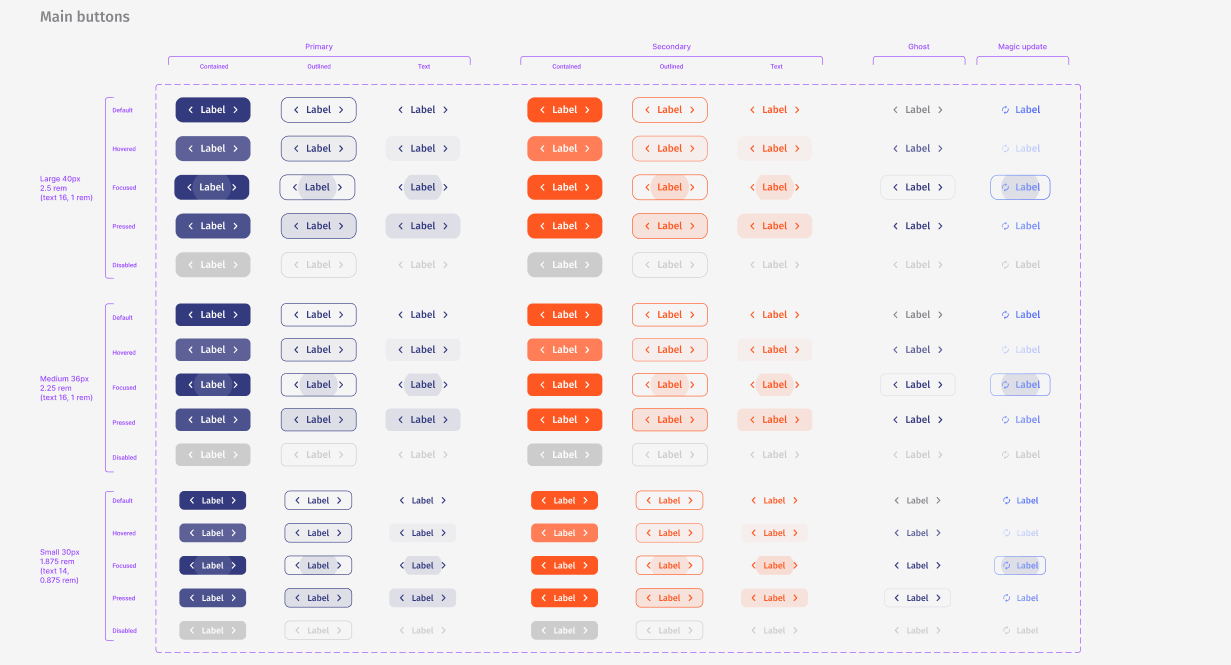
Button matrix: primary, secondary, ghost and magic update buttons in contained, outlined and text variants, across default, hovered, focused, pressed and disabled states in large, medium and small sizes
Buttons: every variant in every state and size, including the magic variant.
Input matrix: default, comment, date and stepper inputs and their magic versions across default, hovered, focused, disabled, error, filled and read-only states, plus date range inputs
Chip (status) page: twelve colours in medium, small and circle sizes, with a description of status chips
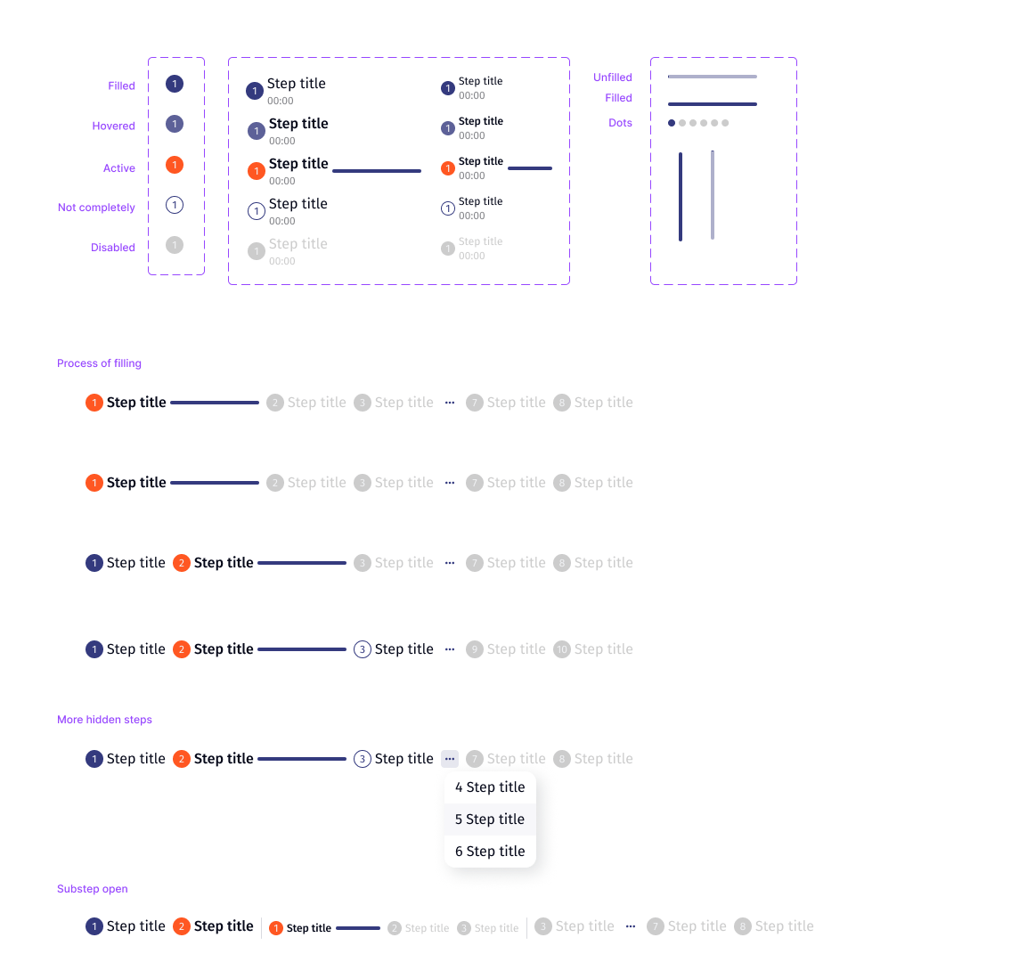
Stepper: step icon states, step and substep variants, progress lines and dots, and horizontal and vertical steppers with hidden steps and open substeps
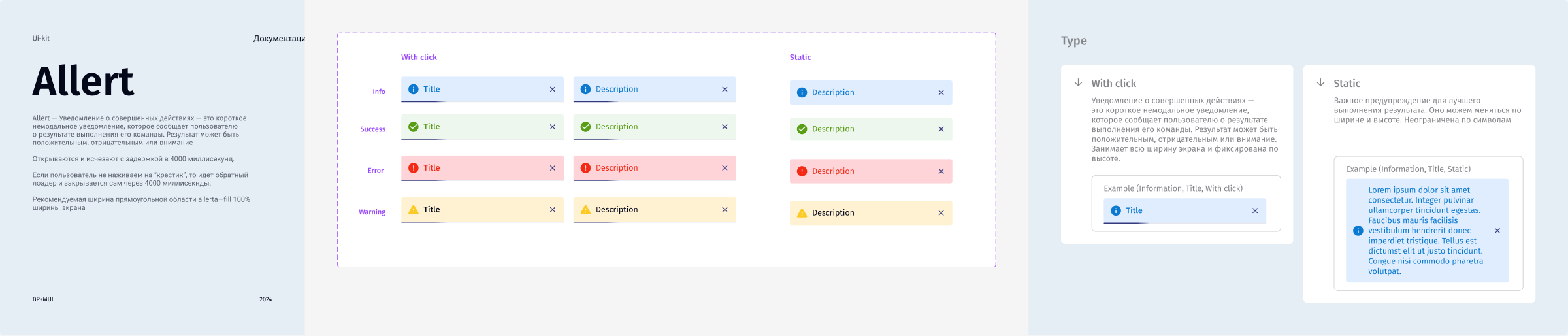
Alert page: info, success, error and warning alerts with title or description, closable and static, with usage notes
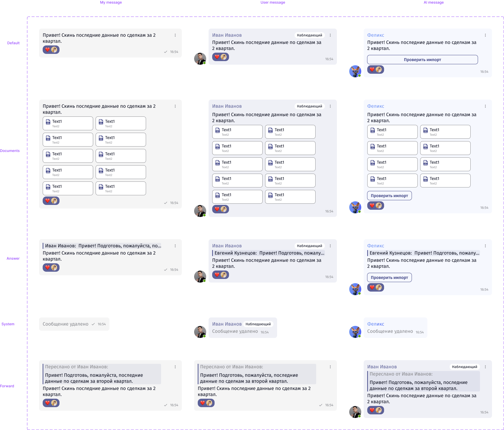
Bubble message component: my message, user message and AI message in text, documents, answer, system and forward types, with reactions, role badges and action buttons
Chat bubbles for the user, other people and the AI assistant, each in five types.

05 Patterns

Tables get their own rules.

Most BusinessPad work happens in tables, so the table has a set of documented patterns: sorting, columns, rows, quick filters, inline editing, bulk actions, expandable rows and hover.
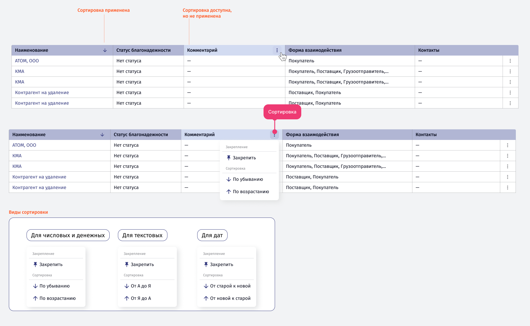
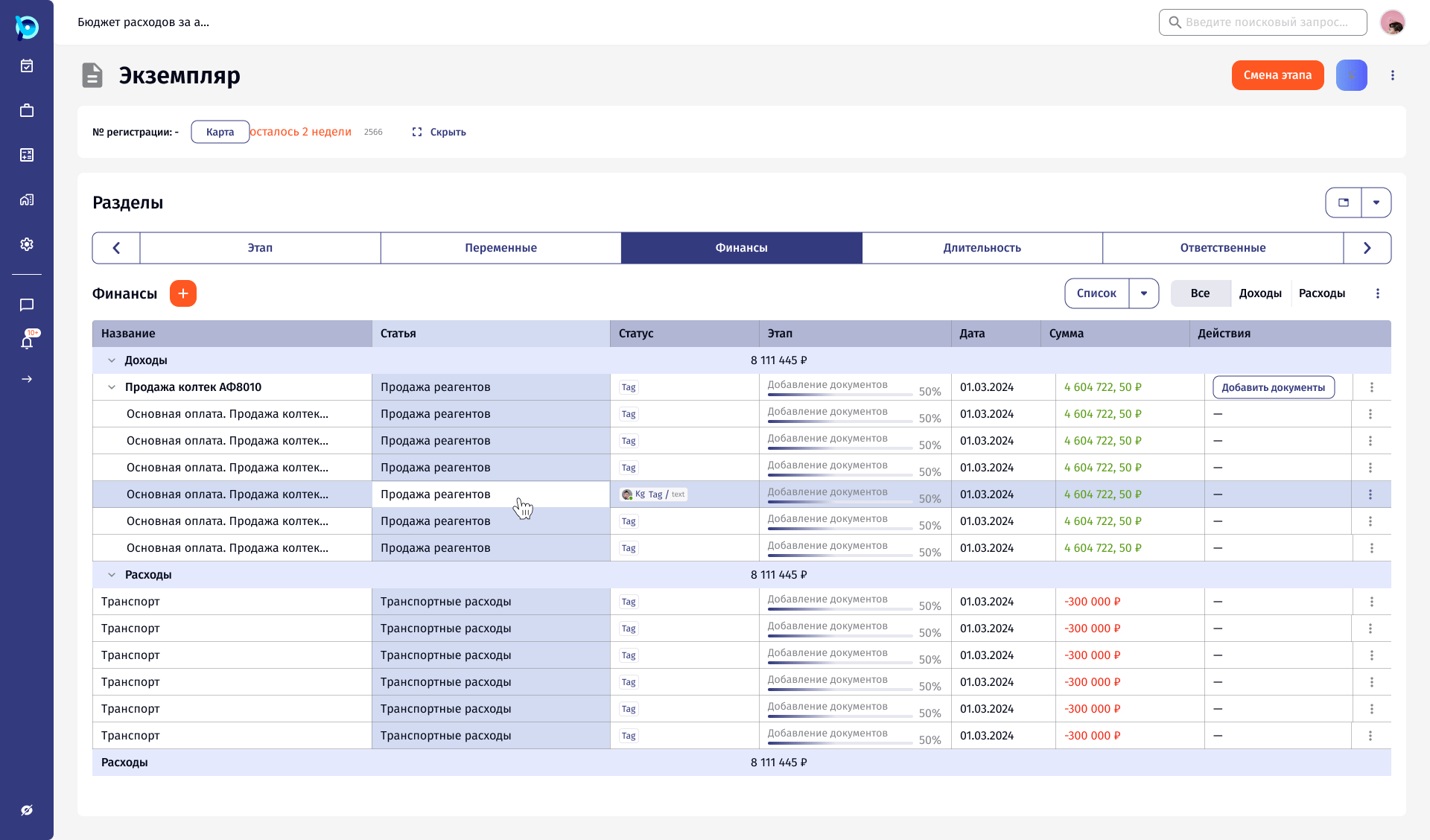
Table pattern: applied and available sorting in column headers, a column menu with pin and sort, and sort labels for numbers, text and dates
Table sorting: the menu wording changes with the data type: numbers, text or dates.
A process instance screen built from the library: section tabs, a finance table grouped into income and expenses with progress, dates, amounts and a hovered row
Components assembled into a product screen: tabs, grouped table, chips, progress and row hover.

06 Approach

A few rules behind the library.

  1. 01

    MUI as the base

    Components keep Material UI names, such as <Button>, <Chip> and <IconButton>, so design and code describe the same thing.

  2. 02

    States are part of the component

    Hover, focus, error, disabled and read only are designed with the default, not after it.

  3. 03

    AI gets its own layer

    Magic tokens and variants mark what the assistant filled or suggested, on the same components people already use.

  4. 04

    Documented on the page

    Each page opens with what the component is for, then variants, then usage notes.