Building consistency across products at scale.
A shared design system for Pernod Ricard's internal digital products, covering foundations, components, patterns and how teams actually used them.
- Pernod Ricard
- Product Designer
- 2021–2023
- Design System · Enterprise
Different products were solving the same problems differently.
As more internal products and teams appeared at Pernod Ricard, the same interface problems were being solved more than once. Buttons, spacing, forms, tables and navigation drifted apart.
Archipelago, the Pernod Ricard design system, gives those products one shared starting point: foundations, components and documentation that explains how to use them.
Colour, spacing and grid decided once.
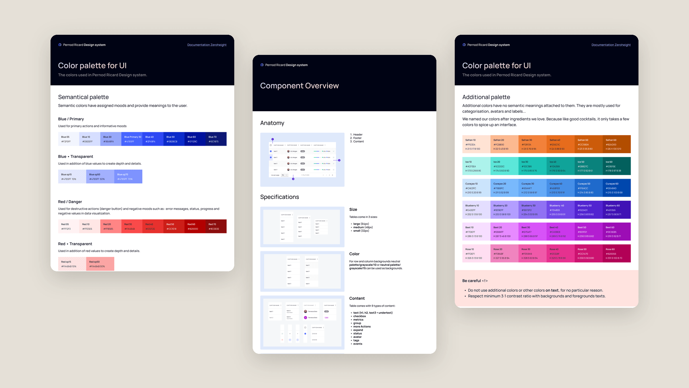
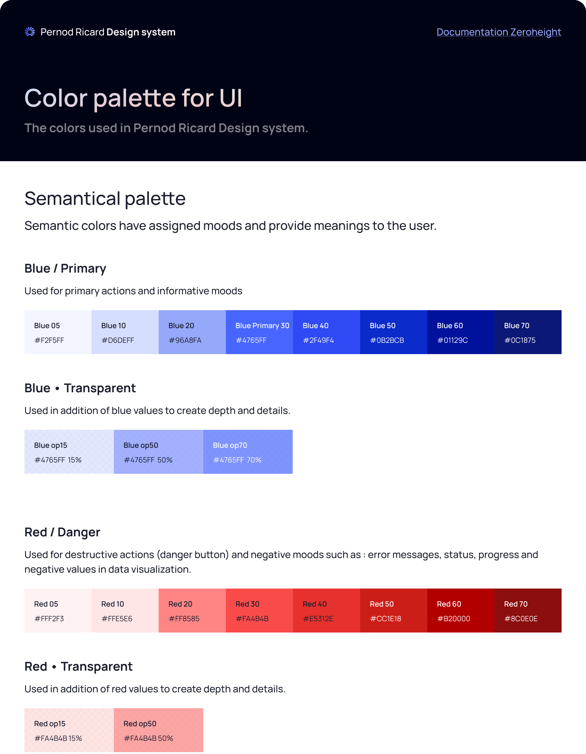
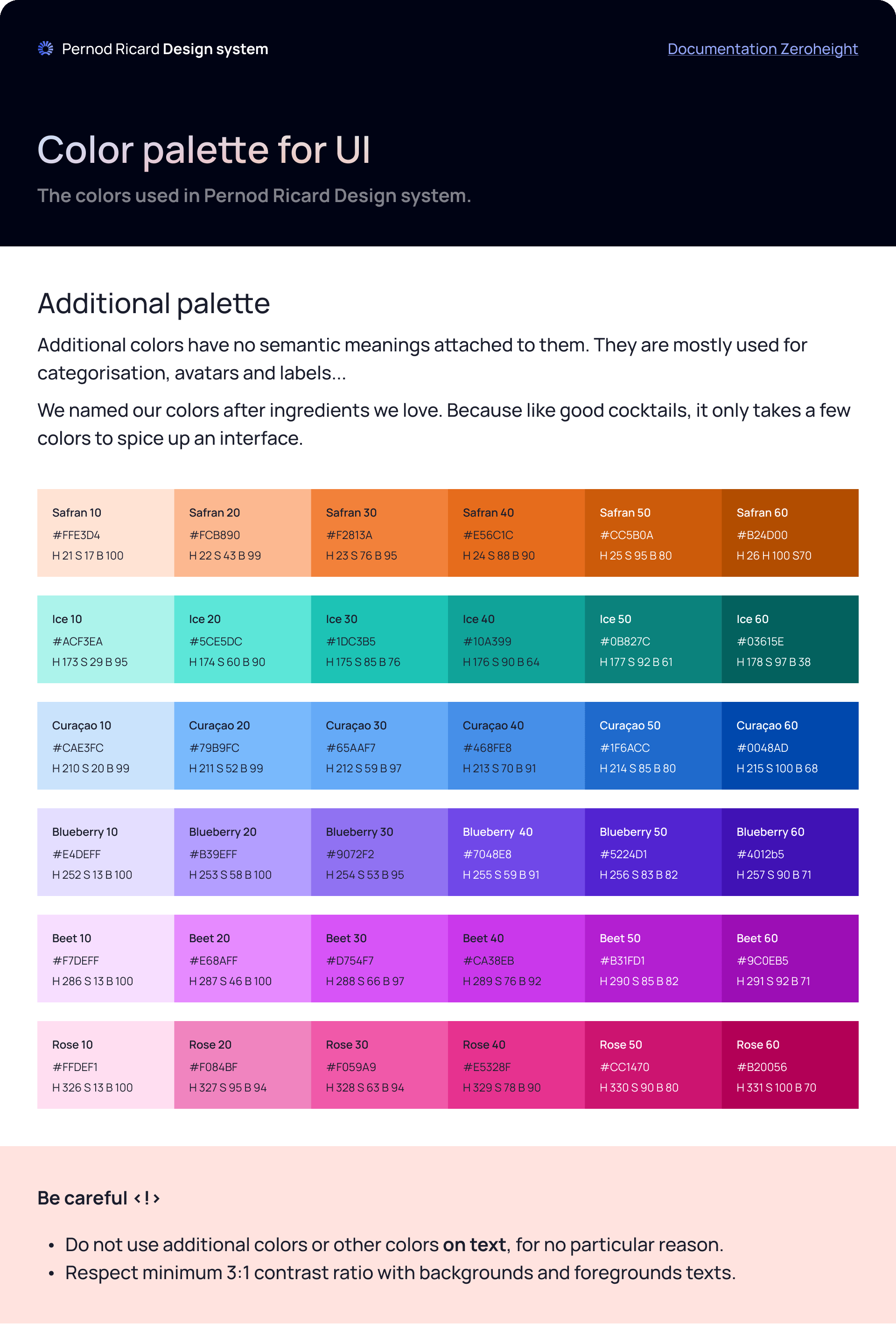
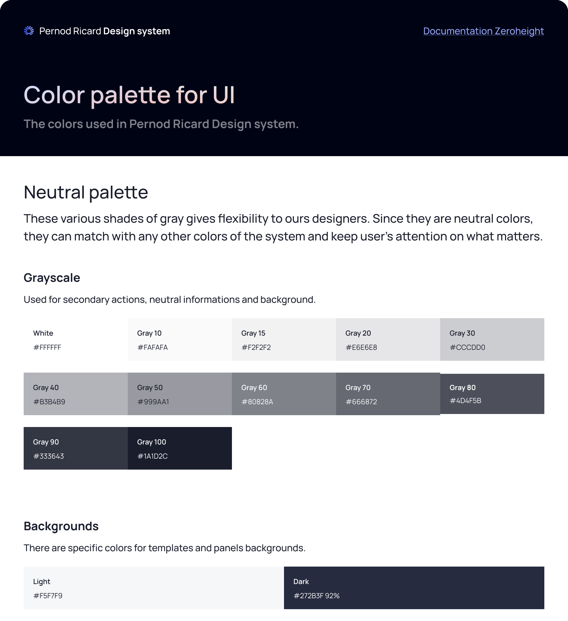
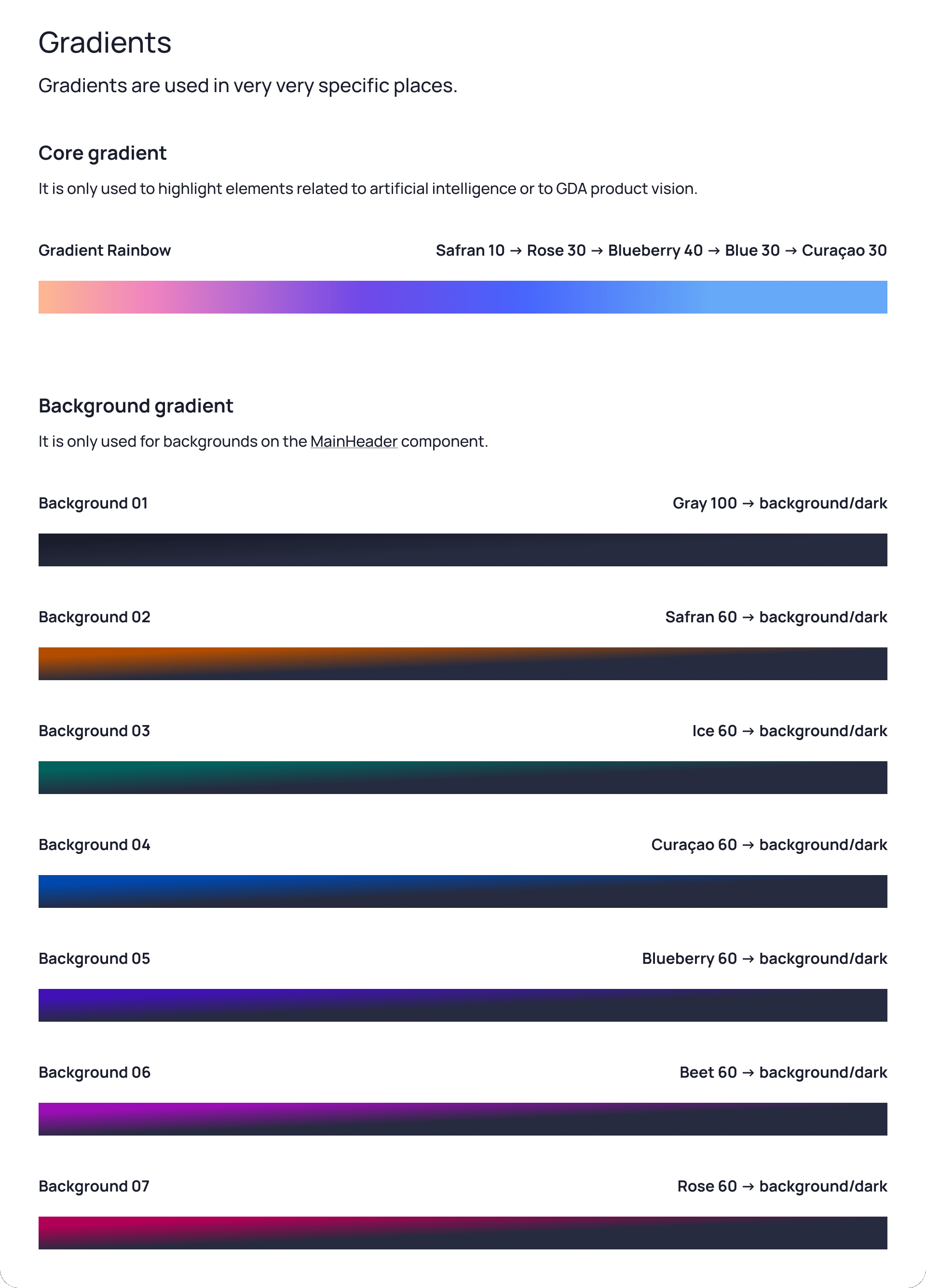
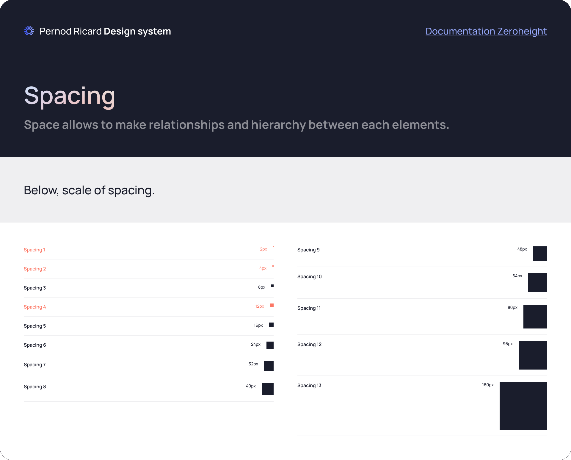
Everything is built on an 8px base unit. Colours are split by role: semantic colours carry meaning, neutrals do the quiet work, and an additional palette is reserved for categories, avatars and labels.
The additional colours are named after cocktail ingredients, such as Safran, Ice, Curaçao and Blueberry. The rules travel with them: no additional colours on text, and at least 3:1 contrast with backgrounds.
- 8px
- Base unit for every element
- 13
- Spacing steps, from 2px to 160px
- 12
- Columns at every breakpoint
- 4
- Semantic colours, eight steps each
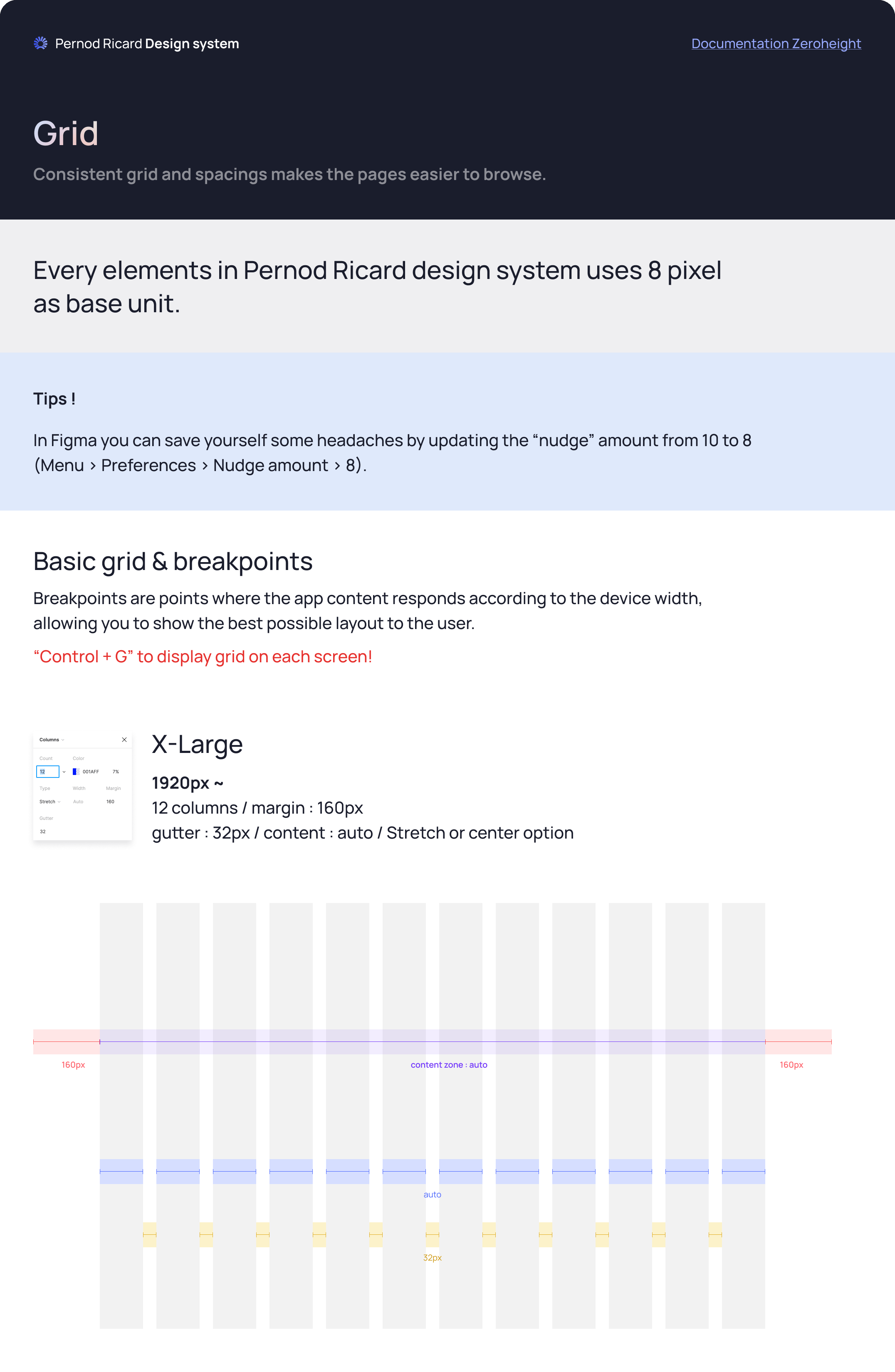
| Size | Width | Margin | Gutter |
|---|---|---|---|
| X-Large | 1920px and up | 160px | 32px |
| Large | 1440–1919px | 112px | 32px |
| Medium | 1072–1439px | 64px | 16px |
Twelve columns everywhere. Only margins and gutters change, so a layout keeps its structure as the screen narrows.
The data table, built cell by cell.
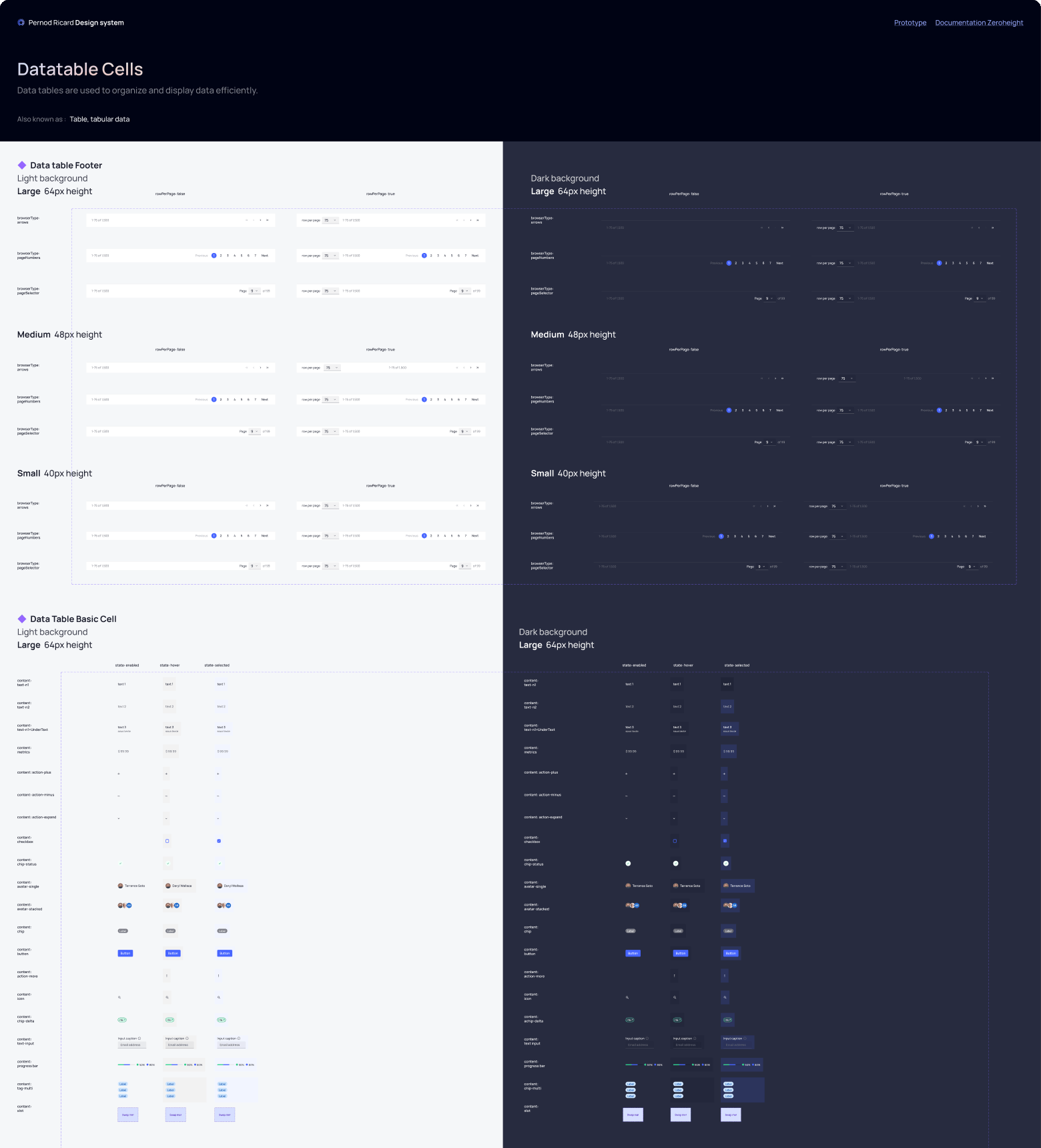
Internal Pernod Ricard tools are full of tables, so the data table is one of the most detailed components. Instead of one large table, it is made of cells, headers and footers that designers combine to build the table a product needs.
3 sizes
Large 64px, medium 48px, small 32px rows.
9 content types
Text, checkbox, metrics, group, more actions, expand, status, avatar, tags and events.
3 footers
Arrows, page numbers or a page selector, with or without rows per page.
Light and dark
Every cell is drawn for both backgrounds.
Every component comes with the same set of pages.
A library leaves too much room for interpretation on its own. Each component is documented in the same order, and the pages link to the documentation in Zeroheight.
Component overview
Anatomy, then specifications: size, colour, content, footer, header and dark background.
Usage
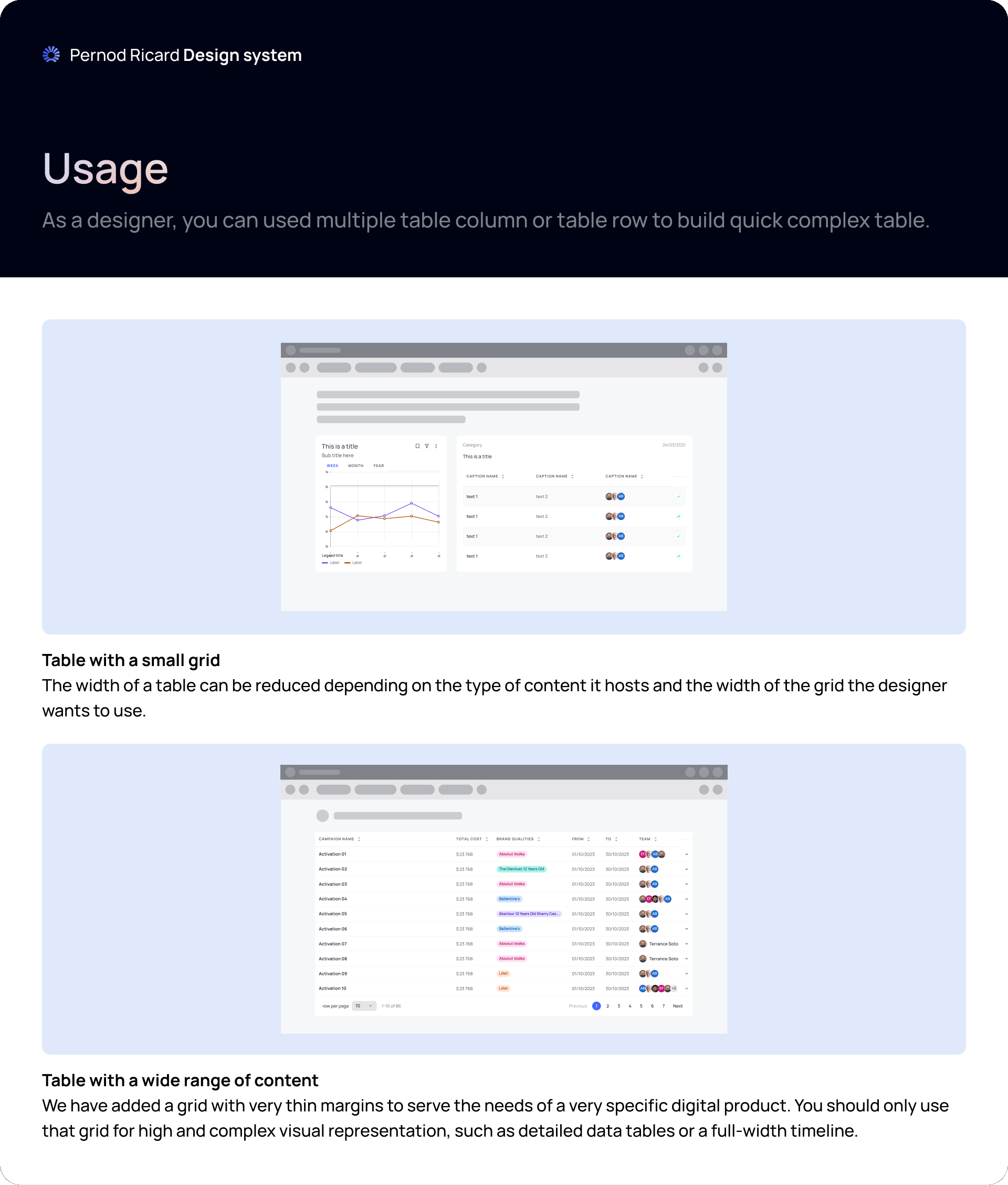
How the component sits in real layouts, such as a table on a small grid or a wide table on a thin-margin grid.
Do & Don’ts
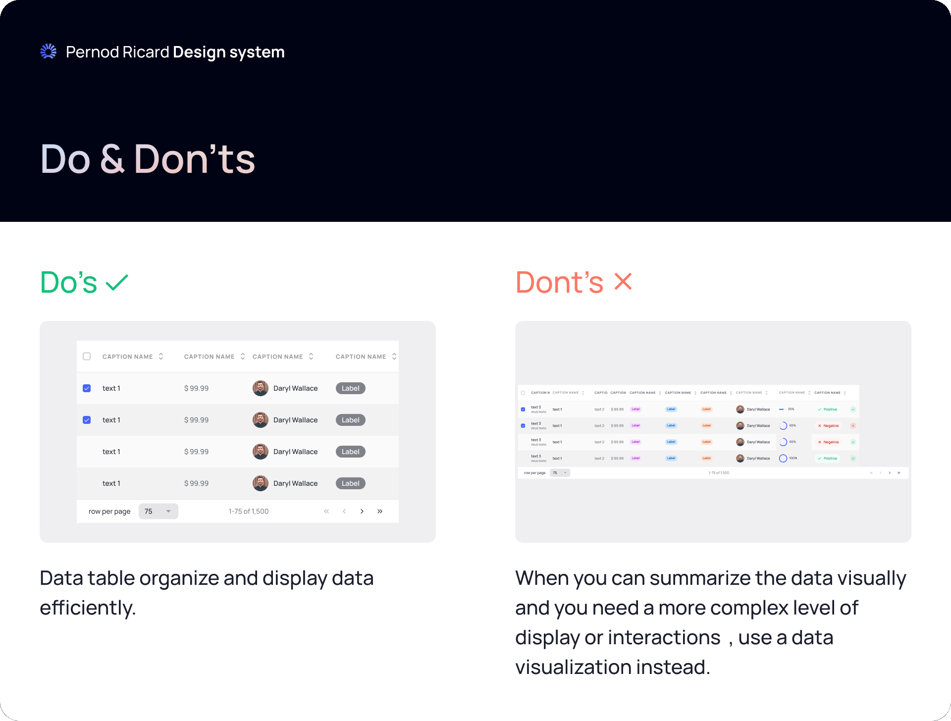
When to use the component, and when something else is the better answer.
Changelog
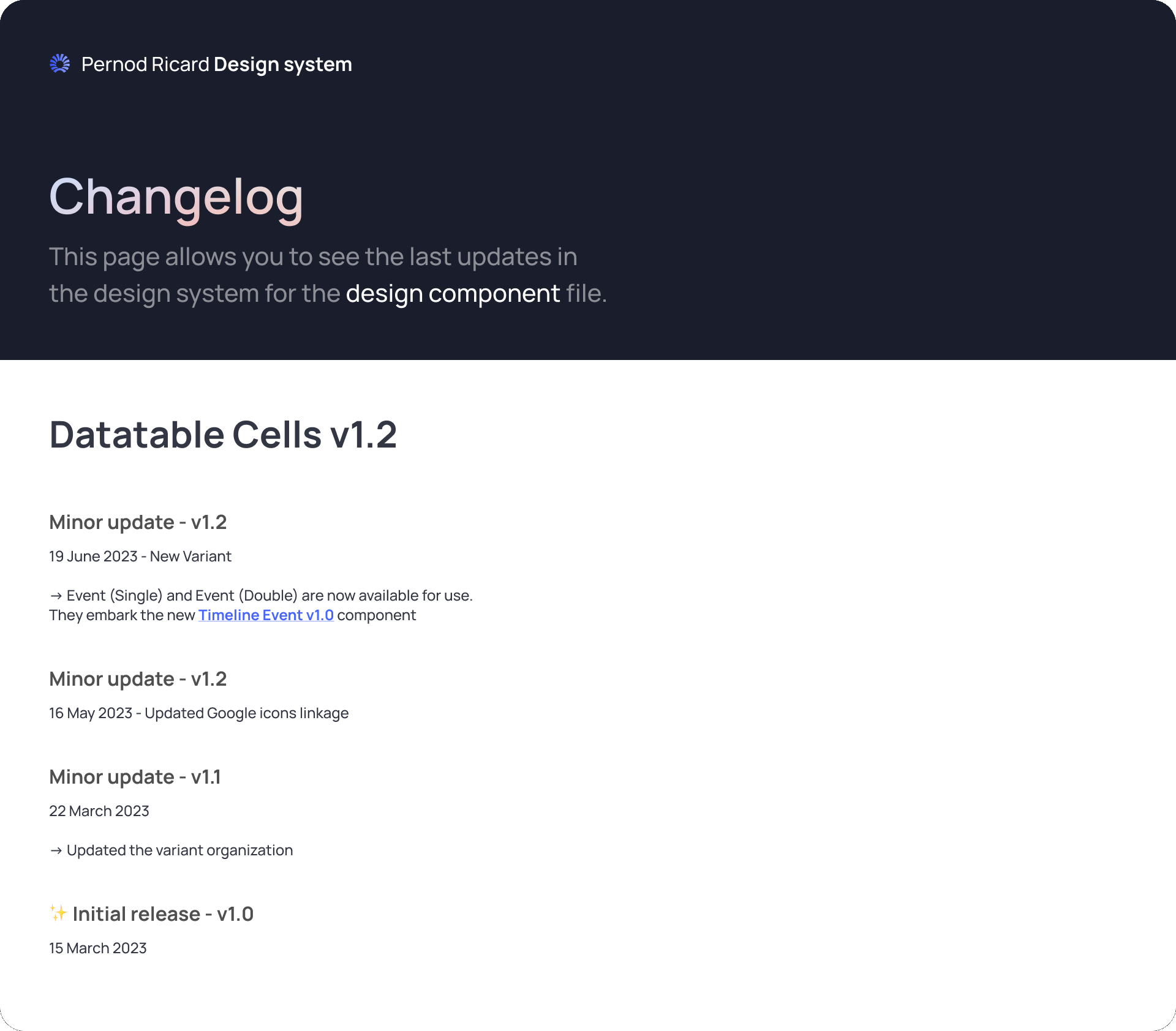
Every version with its date and what changed, so teams know what they are picking up.
Consistency without making every product identical.
Standardise too little, and the system does not help. Standardise too much, and teams work around it. Products share the foundations and components, and keep room to be different when they have a reason.
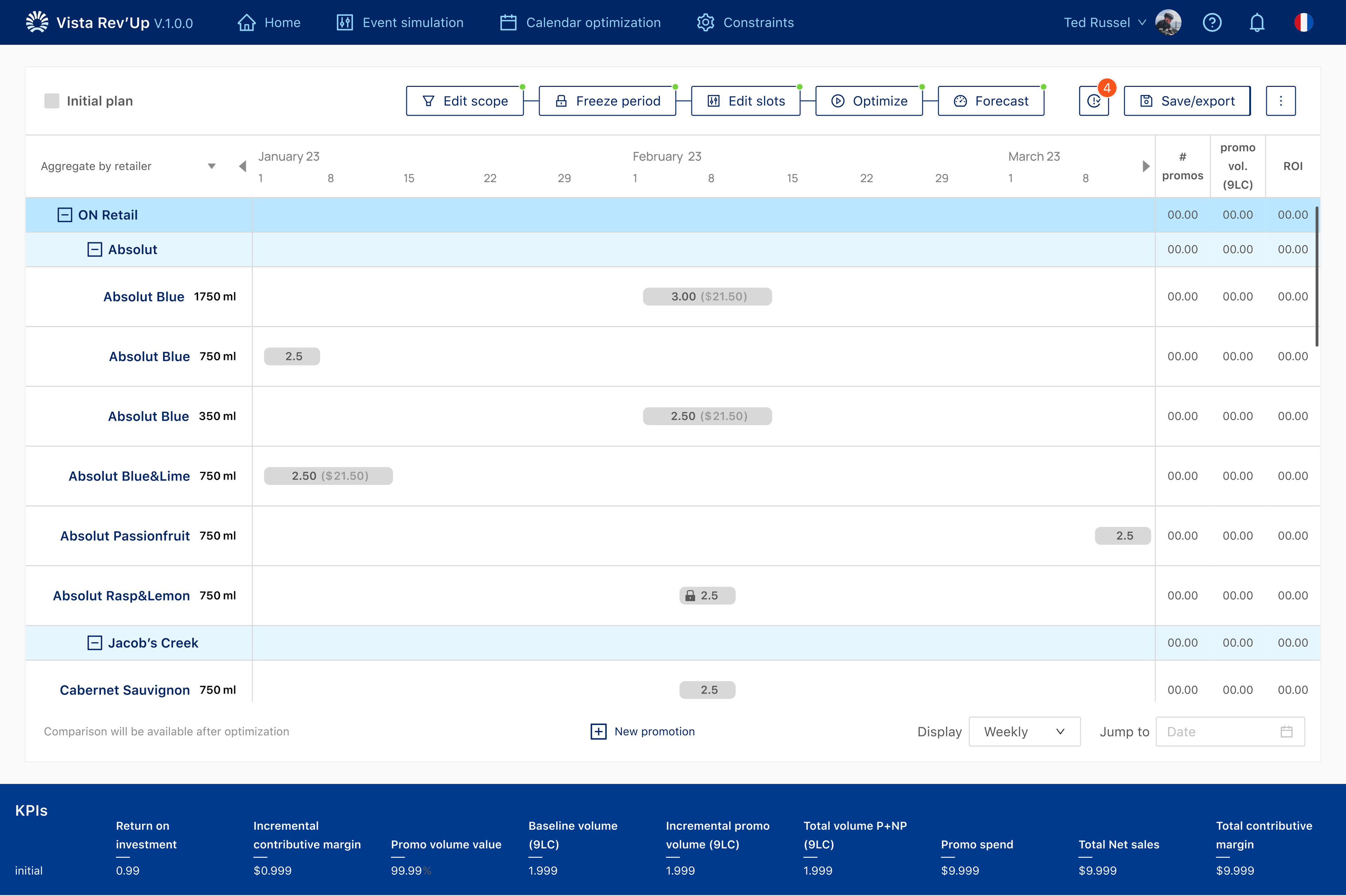
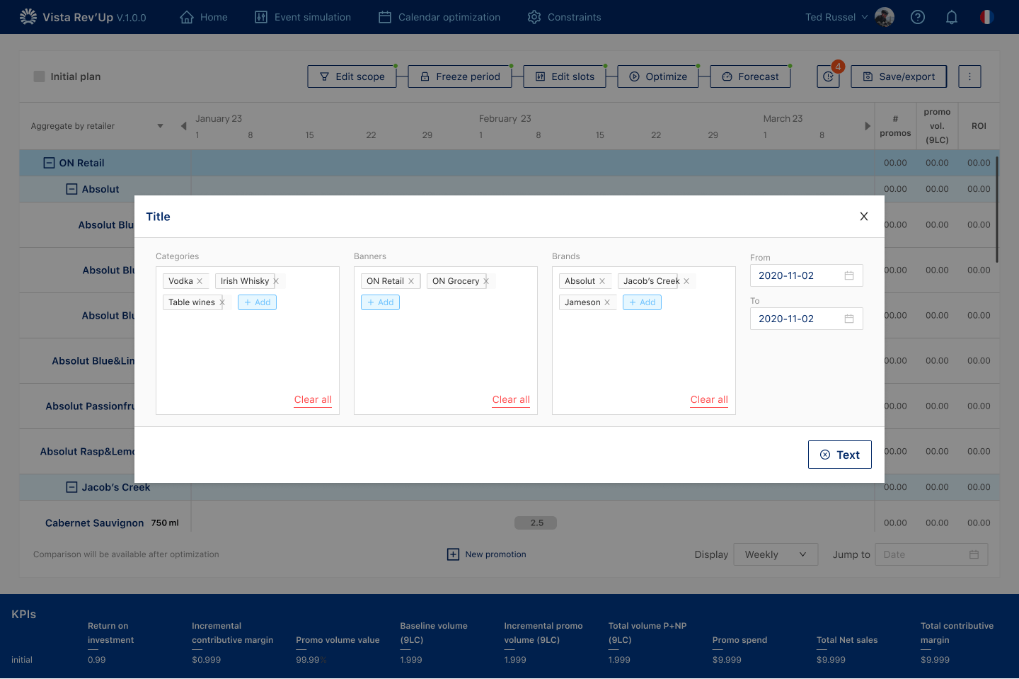
Vista Rev'Up is one of the products built with Archipelago: its calendar table, buttons, chips and modals all come from the system. See the Vista Rev'Up case →
A foundation for products that already existed.
The system was used across 5 internal products. That is a statement of scale, not a claim about efficiency or adoption rate.
The hardest part is deciding what not to include.
Every extra variation makes a system slightly more powerful and slightly harder to understand. Governance is the work of keeping that language shared without turning it into a rulebook teams have to fight.