(04)Design Systems
Archipelago
Archipelago is Pernod Ricard’s design system: one shared starting point for the company’s internal digital products. I contributed to its foundations, components and documentation.
- Company
- Pernod Ricard
- Role
- Product Designer
- Year
- 2021–2023
- Type
- Design System · Enterprise
01Overview
As more internal products and teams appeared at Pernod Ricard, the same interface problems were solved more than once. Archipelago gives those products shared foundations, components and documentation that explains how to use them.
- 8px
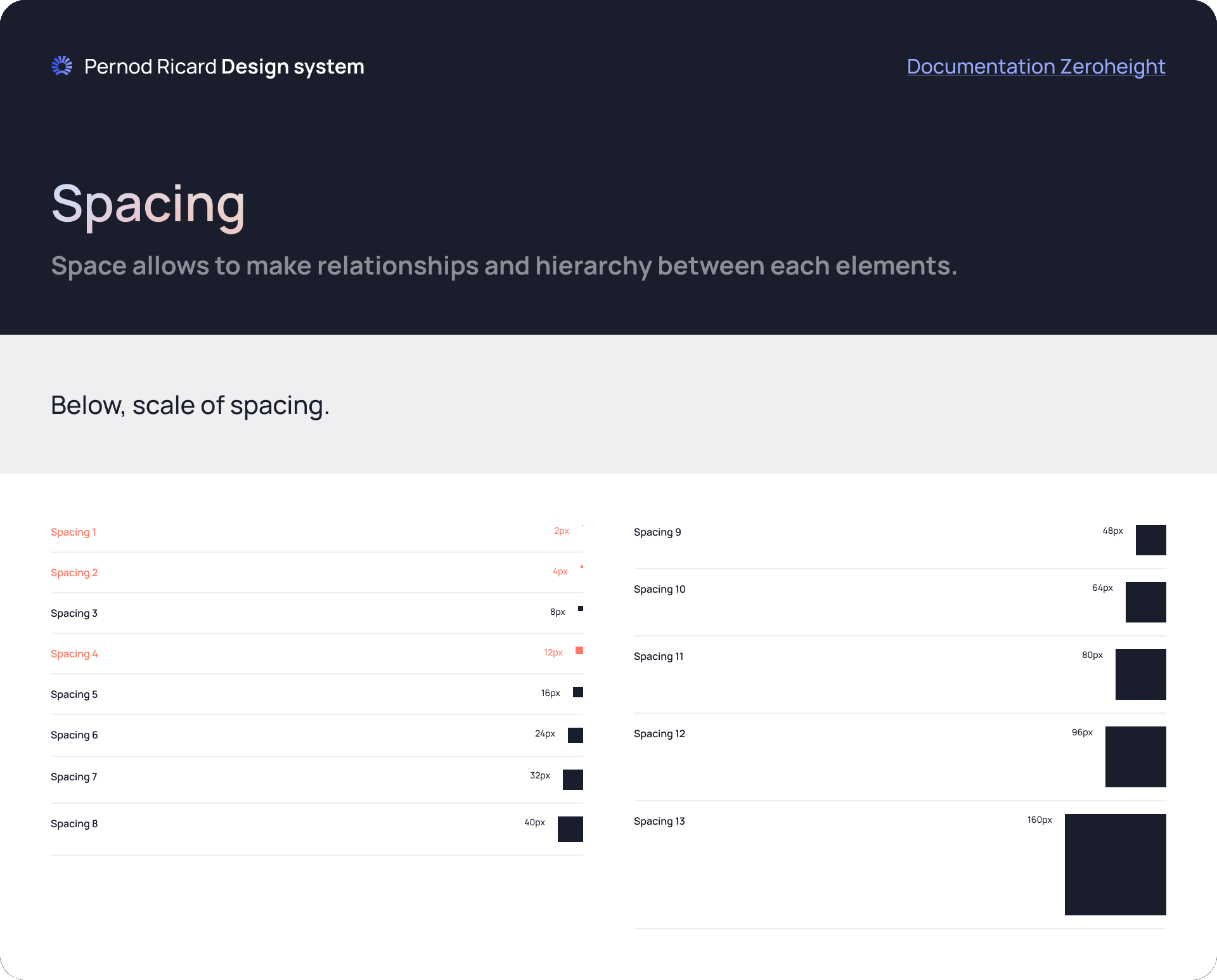
- Base unit for every element
- 13
- Spacing steps, 2px to 160px
- 12
- Columns at every breakpoint
- 5
- Internal products using it
02My role
Product Designer
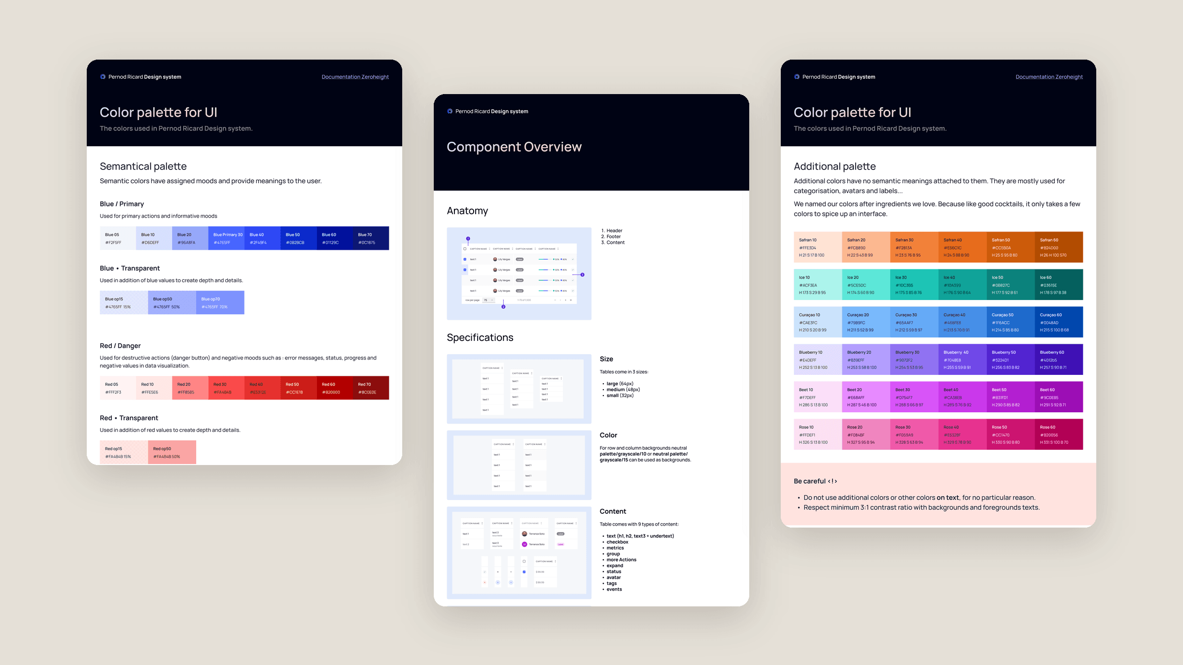
- Foundations: colour, spacing and grid
- The data table, built from cells, headers and footers
- Component documentation pages
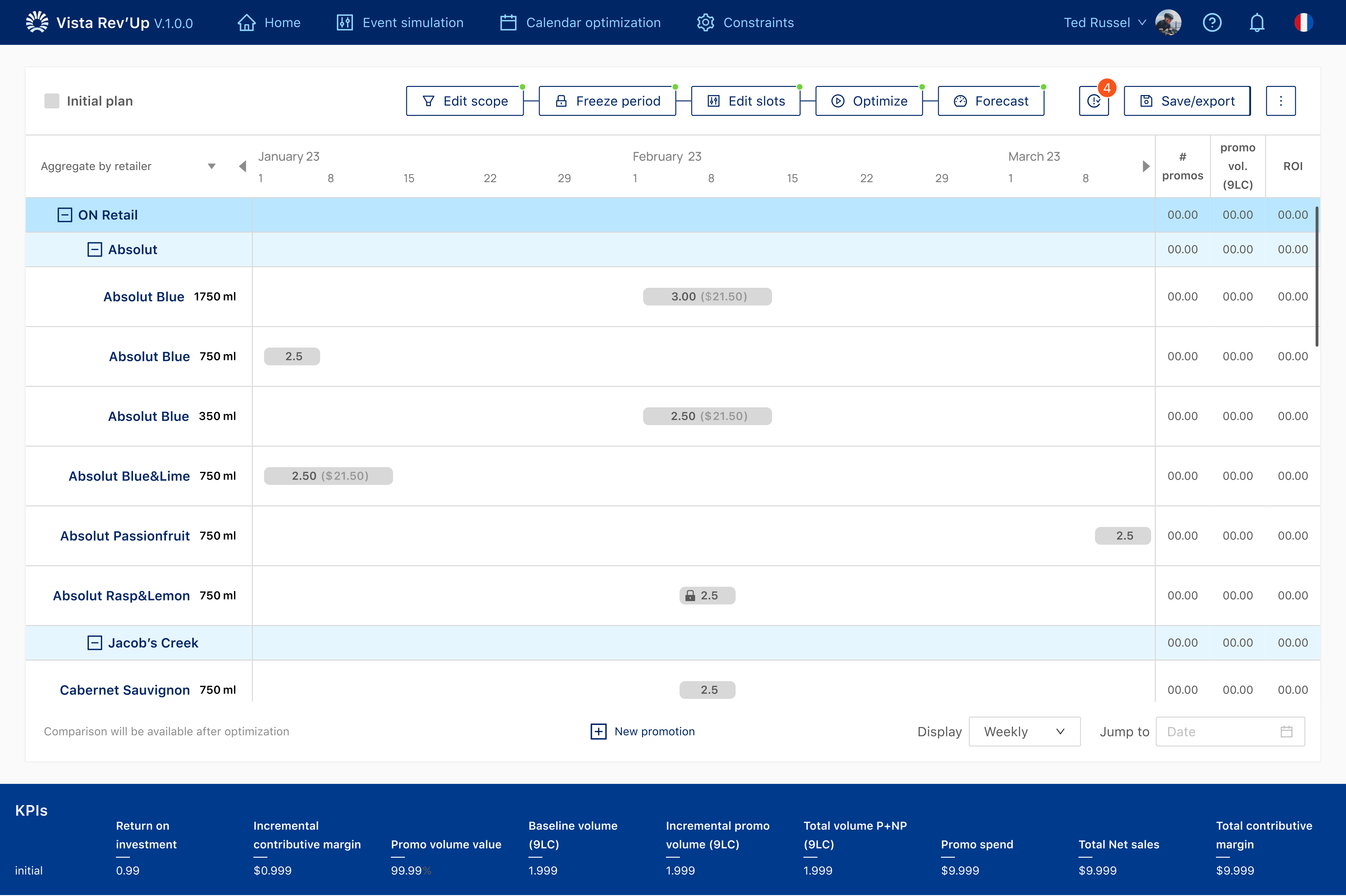
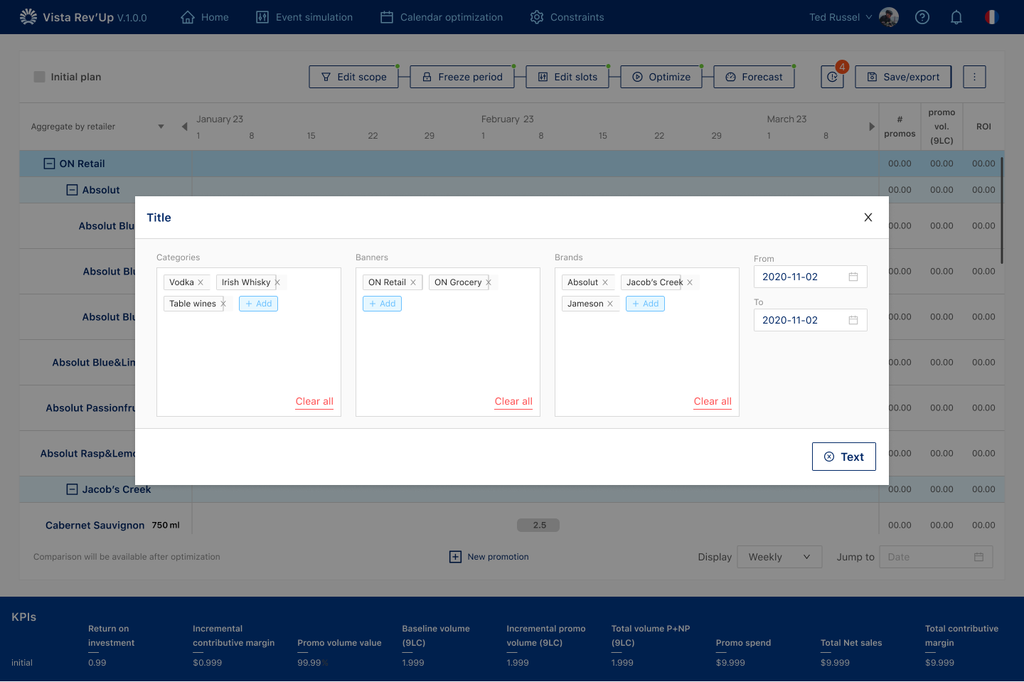
- Applying the system in products such as Vista Rev’Up
03The challenge
Buttons, spacing, forms, tables and navigation had drifted apart between products. A system had to fix that without making every product identical.
- 01Standardise too little and the system doesn’t help
- 02Standardise too much and teams work around it
- 03Internal tools are full of very different tables
04Approach
4.1
Foundations, one component, then the product
Archipelago is the shared starting point for Pernod Ricard’s internal products. The work is the system itself: colour, spacing and a 12-column grid, then components teams actually build with, then the pages that explain how to use them.
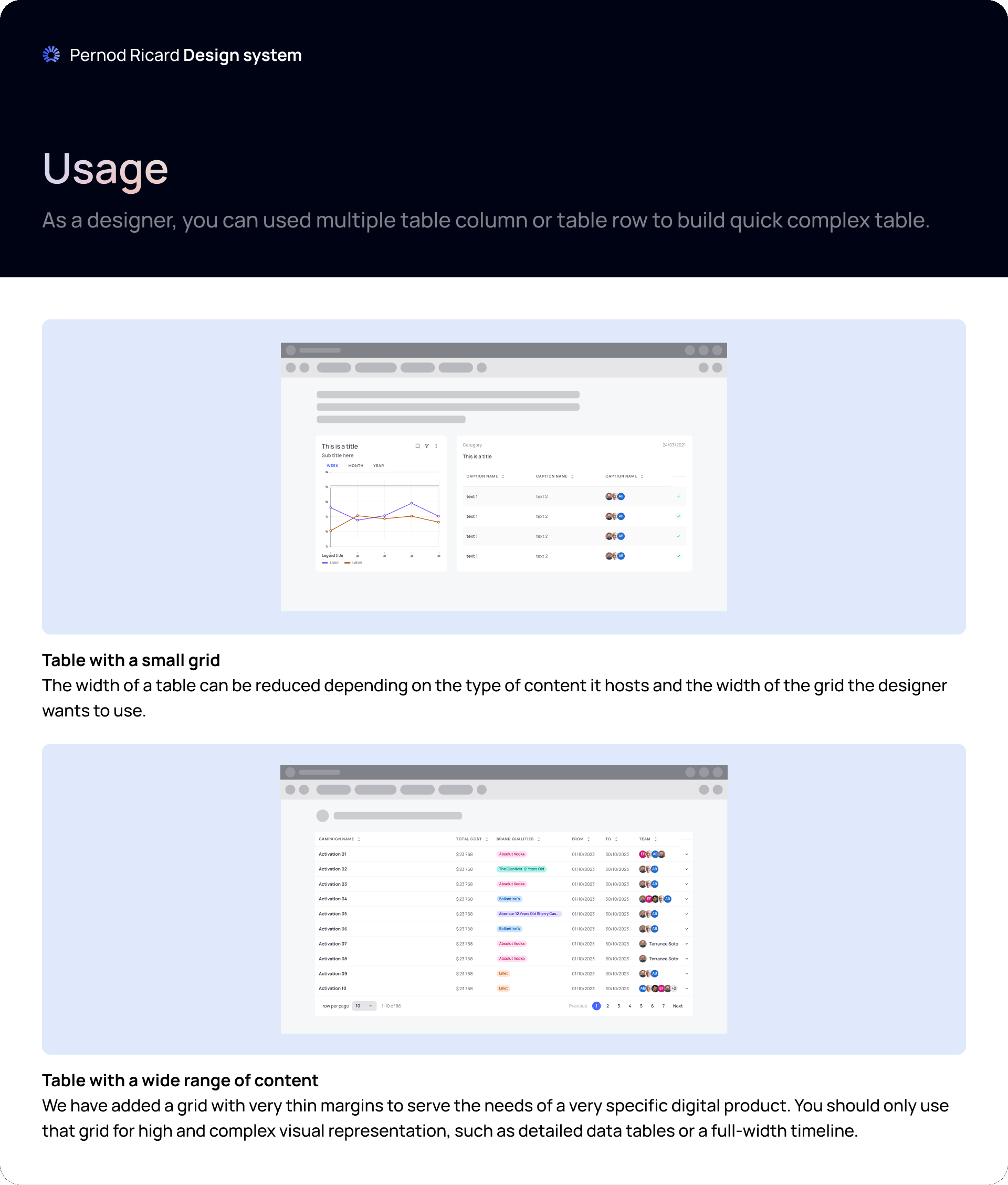
The data table is the clearest example. It is not one finished table. Designers combine cells, headers and footers into the table a product needs. The same parts show up in Vista Rev’Up’s calendar.
05Key flows
5.1
Foundations
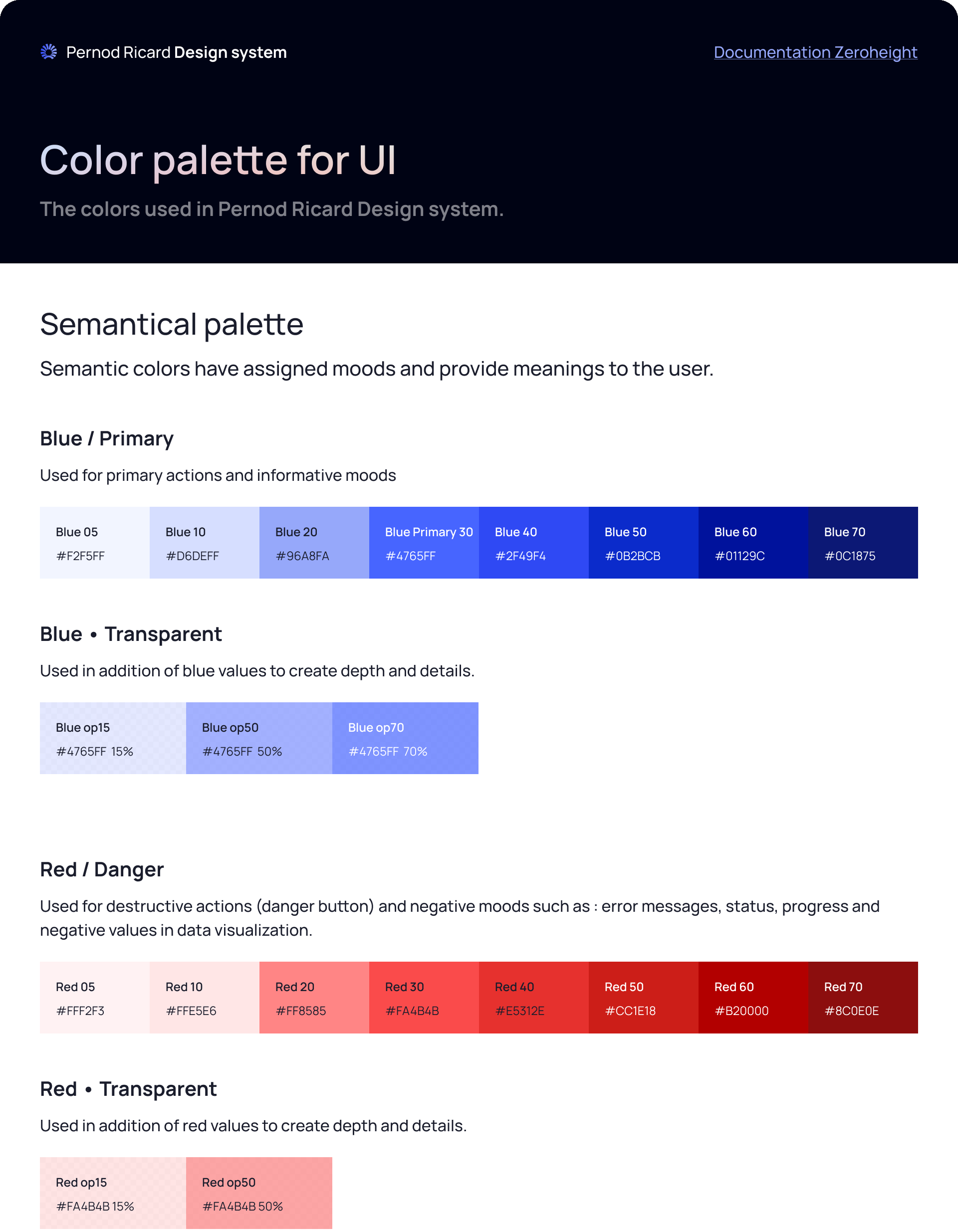
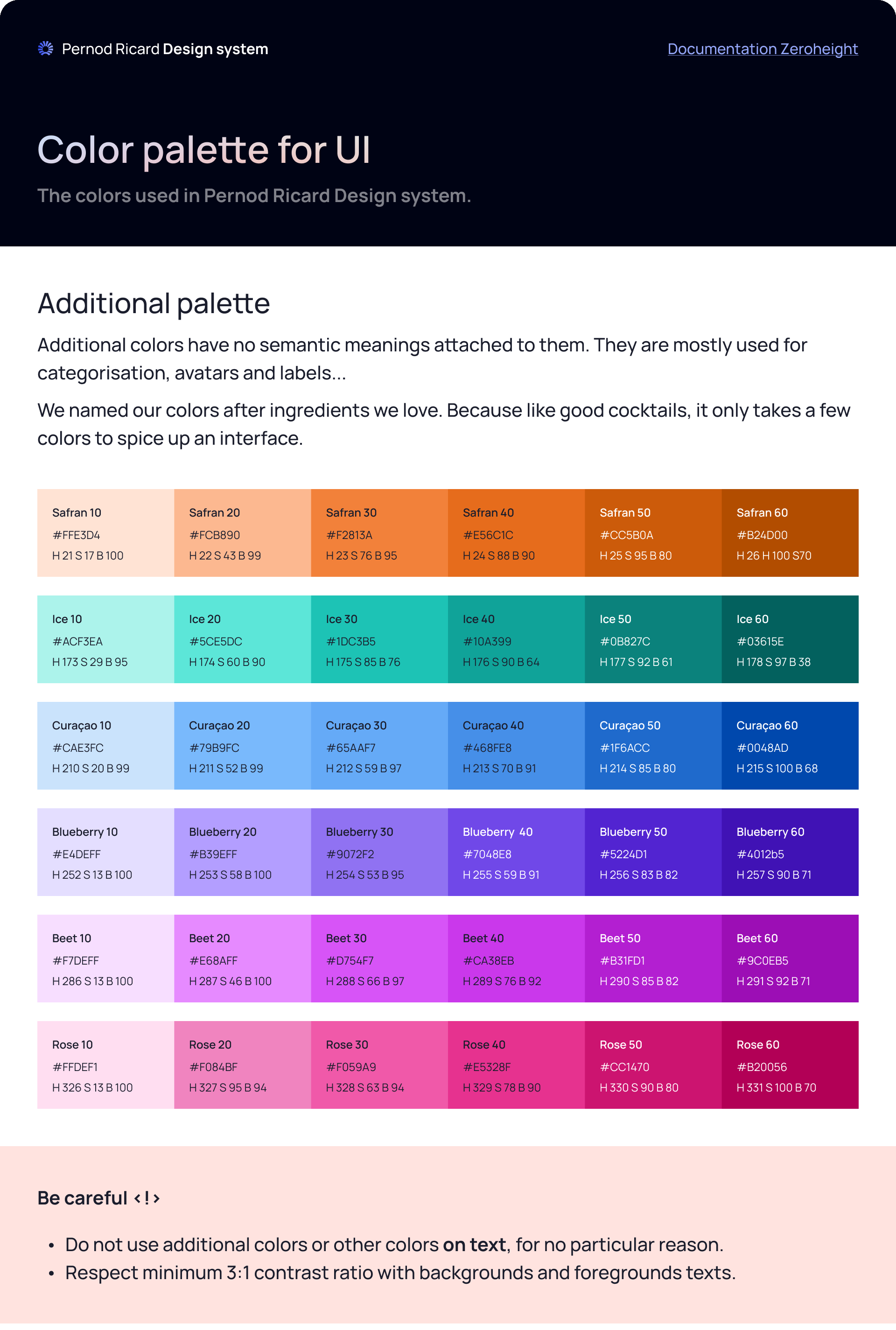
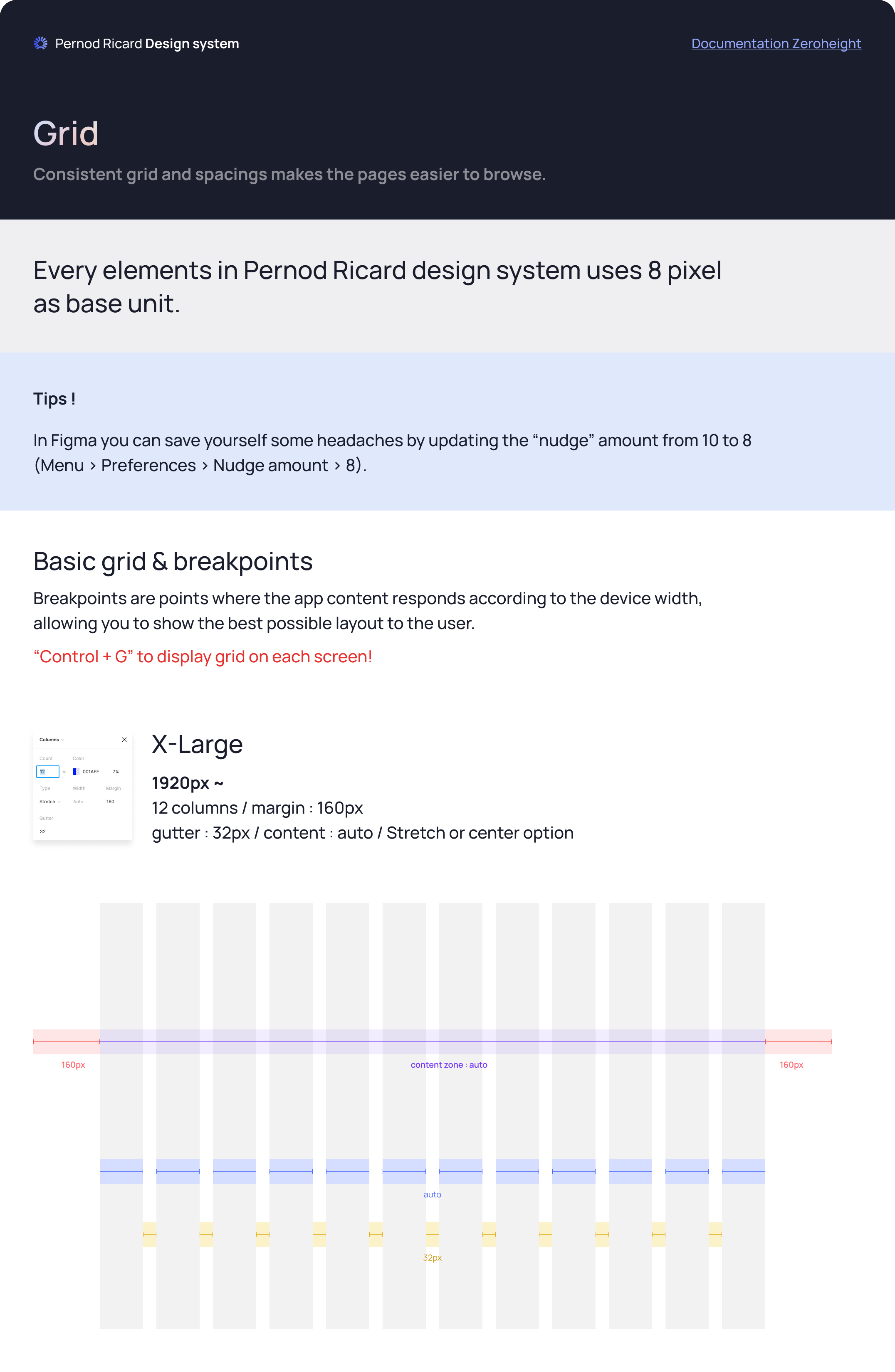
Everything is built on an 8px base. Colours are split by role: semantic colours carry meaning, neutrals do the quiet work, and an additional palette, named after cocktail ingredients, is kept for categories and labels.
 Open full size
 Open full size
 Open full size
 Open full size
5.2
The data table
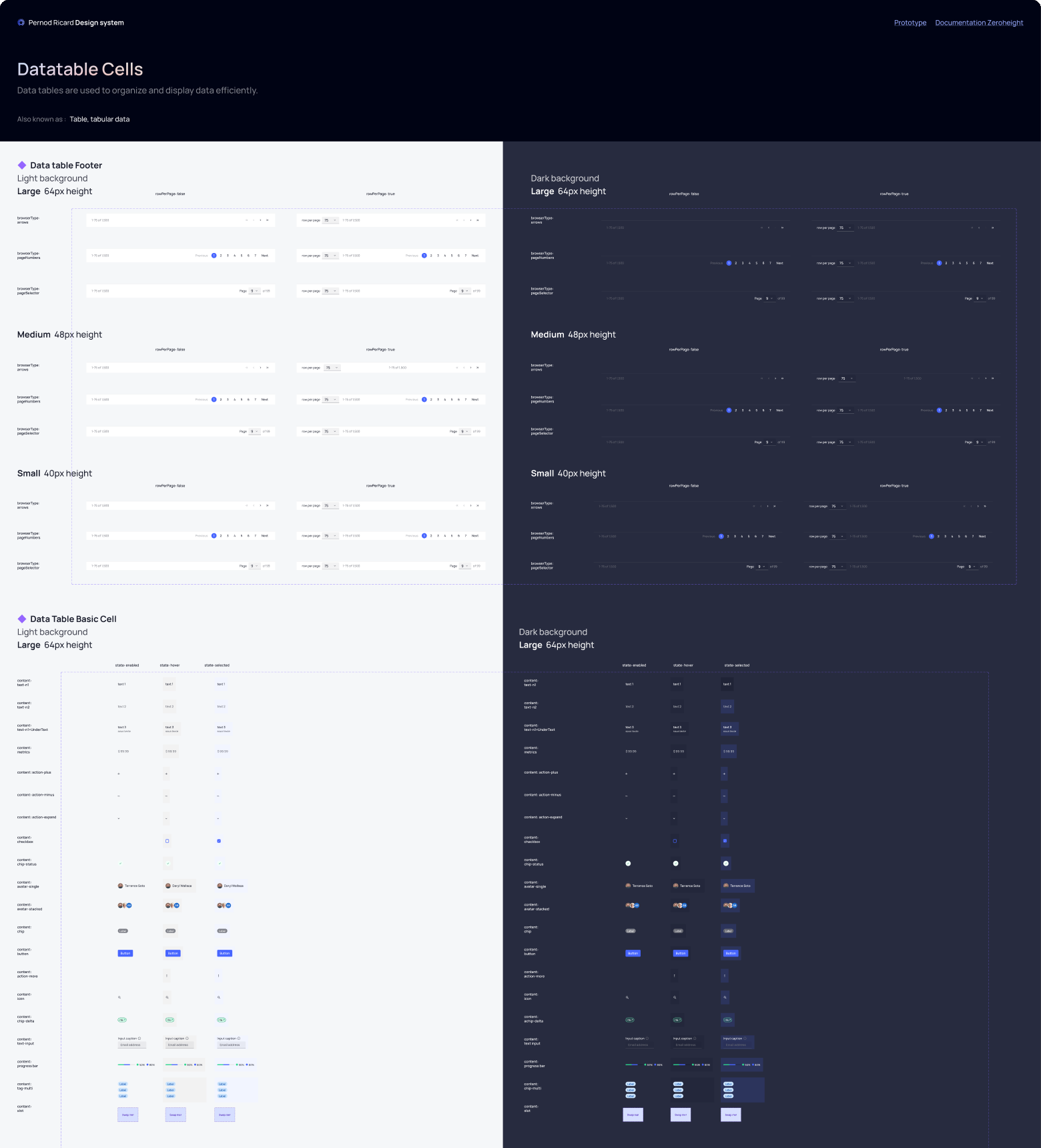
Instead of one large table, designers combine cells, headers and footers into the table a product needs: 3 row sizes, 9 content types, 3 footers, light and dark.
 Open full size
 Open full size
5.3
Documentation
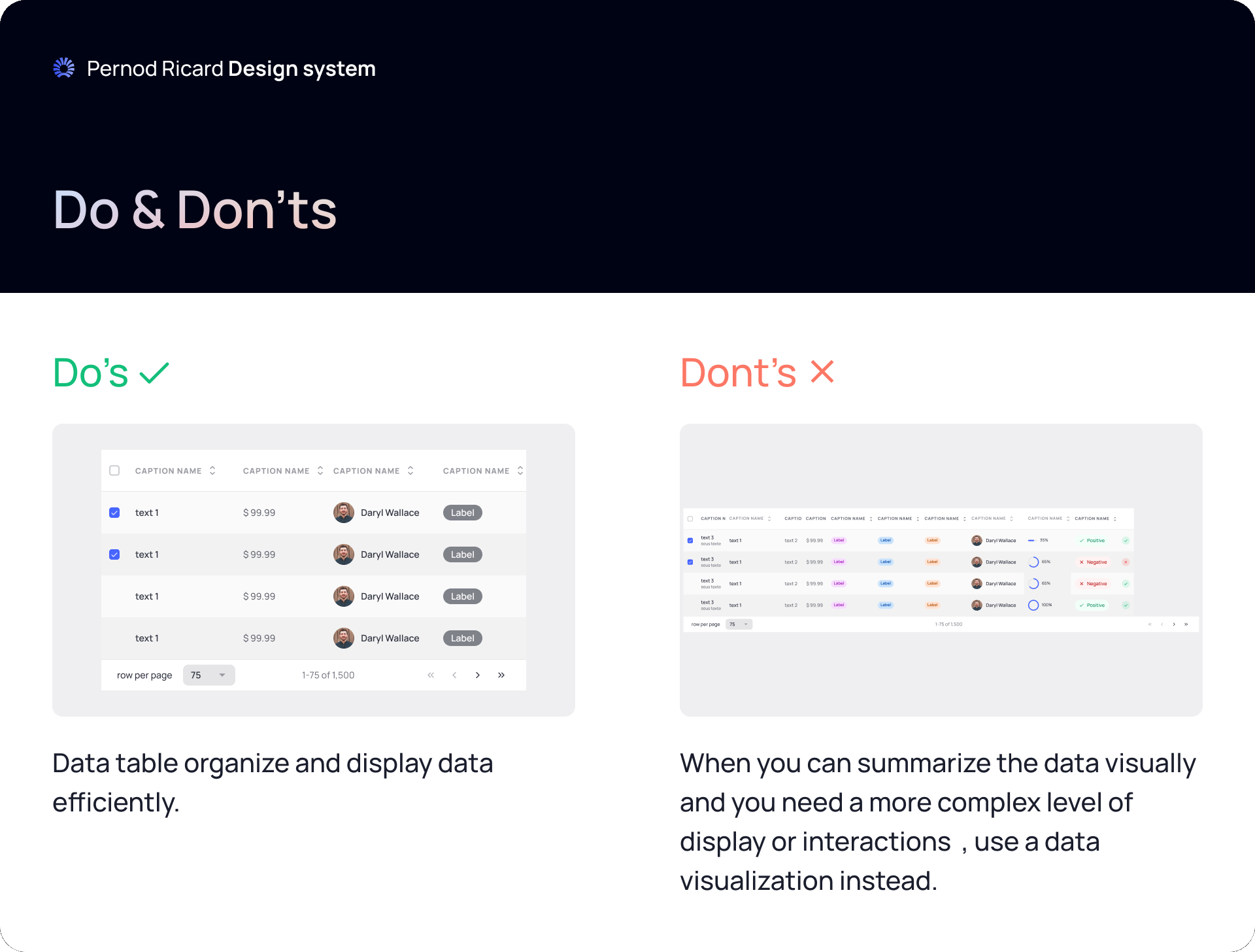
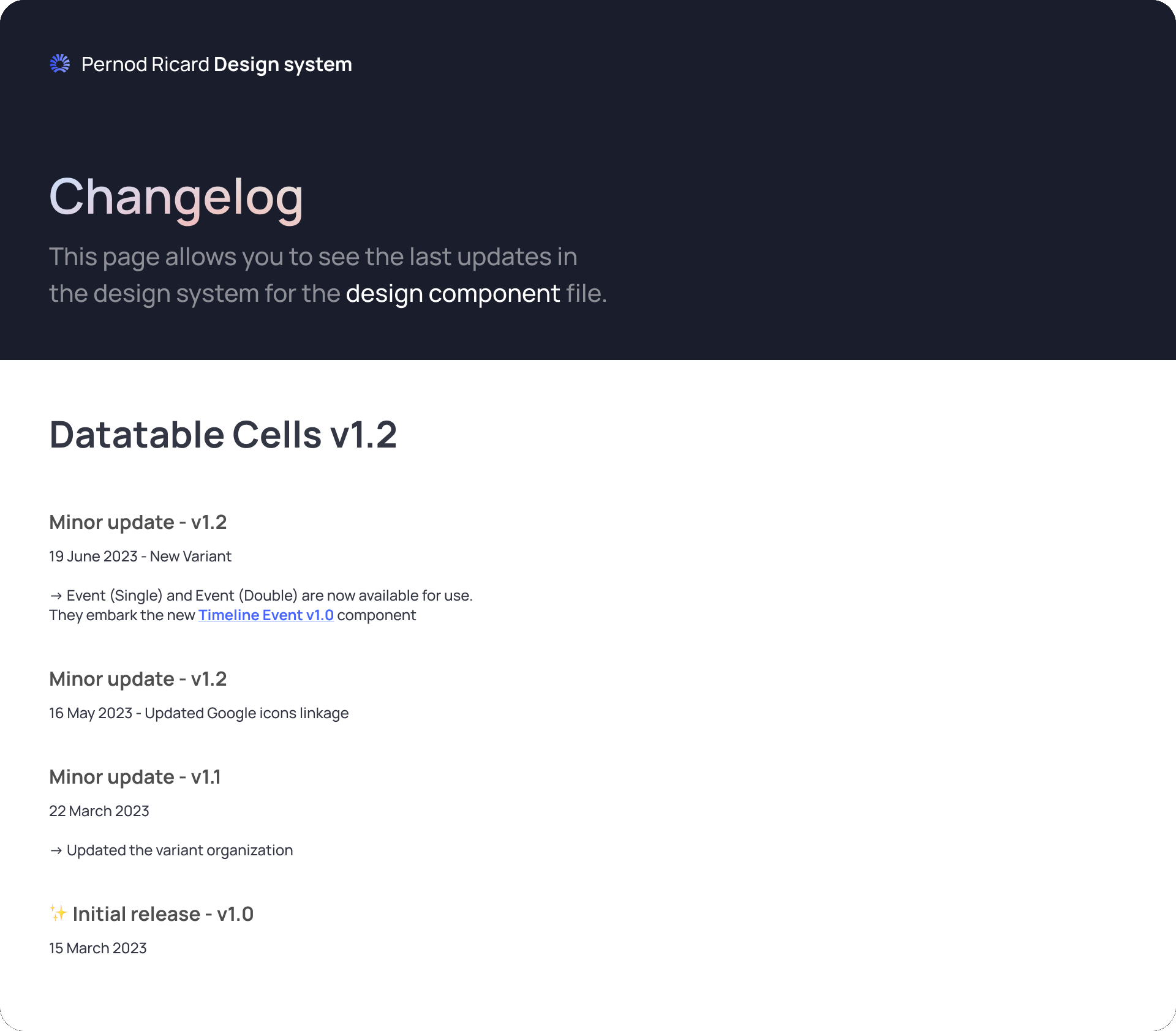
Every component is documented in the same order, linked to Zeroheight: overview, usage, do & don’ts, and a changelog so teams know what they’re picking up.
- 1Overview
- 2Usage
- 3Do & don’ts
- 4Changelog
 Open full size
 Open full size
5.4
In a product
Vista Rev’Up’s calendar table, buttons, chips and modals all come from the system.
 Open full size
 Open full size
06Design decisions
Decide it once
Colour, spacing and grid are fixed at the foundation level, so products don’t re-decide them.
Twelve columns everywhere
Only margins and gutters change, so a layout keeps its structure as the screen narrows.
Rules travel with colours
No additional colours on text, and at least 3:1 contrast with backgrounds.
Room to differ
Products share foundations and components, and can still be different when they have a reason.
07Outcome
The system was used across five internal products. The hardest part was deciding what not to include: every extra variation makes a system slightly more powerful and slightly harder to understand.